Data visualization and ggplot2
Data visualization
Introduction: The importance of visualizing data
In this class, we’ll learn how to use the package
ggplot2 to visualize your data. In addition to this
document, there are a ton of resources to help you learn and understand
ggplot. Some are linked in this document.
library(ggplot2)
library(dplyr)
library(tidyr)
library(RColorBrewer) # used for color-blind friendly palettes
library(palmerpenguins) # used for data in the final comprehension check
# if you want to reproduce the full document, you will also need the fontawesome package.
Descriptive and inferential statistics are incredibly useful for understanding your data. However, as we have discussed, they are models and models always have error. We have to live with a certain amount of error, but we should make sure that our model is at least useful. For example, is a statement like “the vast majority of humans have more than the mean number of eyes” all that useful?
One way that we can assess the usefulness of our numeric models is to visualize the data.
Anscombe data set
(Note: For much of the code in this first section, don’t stress if you don’t understand everything the code is doing. Much of this is for demonstration purposes and the parts that we expect you to understand will be explained in more detail.)
Let’s look at the “anscombe” data set that comes with the base R
package datasets.
data("anscombe")
str(anscombe)
## 'data.frame': 11 obs. of 8 variables:
## $ x1: num 10 8 13 9 11 14 6 4 12 7 ...
## $ x2: num 10 8 13 9 11 14 6 4 12 7 ...
## $ x3: num 10 8 13 9 11 14 6 4 12 7 ...
## $ x4: num 8 8 8 8 8 8 8 19 8 8 ...
## $ y1: num 8.04 6.95 7.58 8.81 8.33 ...
## $ y2: num 9.14 8.14 8.74 8.77 9.26 8.1 6.13 3.1 9.13 7.26 ...
## $ y3: num 7.46 6.77 12.74 7.11 7.81 ...
## $ y4: num 6.58 5.76 7.71 8.84 8.47 7.04 5.25 12.5 5.56 7.91 ...head(anscombe)## x1 x2 x3 x4 y1 y2 y3 y4
## 1 10 10 10 8 8.04 9.14 7.46 6.58
## 2 8 8 8 8 6.95 8.14 6.77 5.76
## 3 13 13 13 8 7.58 8.74 12.74 7.71
## 4 9 9 9 8 8.81 8.77 7.11 8.84
## 5 11 11 11 8 8.33 9.26 7.81 8.47
## 6 14 14 14 8 9.96 8.10 8.84 7.04The anscombe data set has eight variables, each with 11 observations.
We’ll use dplyr to get summary statistics. But before,
let’s convert the data into a “long” format so that it’s a bit easier to
work with. We’ll use the tidyr function
pivot_longer. The argument cols selects the
columns that you want to pivot. Since we only have numeric variables, we
can pivot everything to a long format. To do that, we’ll use
cols = everything(). The anscombe data contains 4 sets of
\(x\) and \(y\) data. The argument
names_to and names_pattern work in tandem to
restructure the data.
anscombe <- anscombe |>
  pivot_longer(cols = everything(),
                          names_to = c(".value", "set"),
                          names_pattern = "(.)(.)")
str(anscombe)
## tibble [44 × 3] (S3: tbl_df/tbl/data.frame)
## $ set: chr [1:44] "1" "2" "3" "4" ...
## $ x : num [1:44] 10 10 10 8 8 8 8 8 13 13 ...
## $ y : num [1:44] 8.04 9.14 7.46 6.58 6.95 8.14 6.77 5.76 7.58 8.74 ...head(anscombe)## # A tibble: 6 × 3
## set x y
## <chr> <dbl> <dbl>
## 1 1 10 8.04
## 2 2 10 9.14
## 3 3 10 7.46
## 4 4 8 6.58
## 5 1 8 6.95
## 6 2 8 8.14Now, we’ll use dplyr functions to get summary statistics
for x and y (for each set).
anscombe |>
  group_by(set) |>
  summarise(mean_x = mean(x),
            sd_x = sd(x),
            mean_y = mean(y),
            sd_y = sd(y
                      )
            )
## # A tibble: 4 × 5
## set mean_x sd_x mean_y sd_y
## <chr> <dbl> <dbl> <dbl> <dbl>
## 1 1 9 3.32 7.50 2.03
## 2 2 9 3.32 7.50 2.03
## 3 3 9 3.32 7.5 2.03
## 4 4 9 3.32 7.50 2.03### NON-DPLYR APPROACH
## you can use the function `tapply` to get summary stats by a grouping in a data set
## e.g.,
# tapply(X = anscombe$y, INDEX = anscombe$set, FUN = mean)
## you would then need to repeat this function, changing the X and FUN arguments What do you notice about the four sets?
For all four sets, the mean of x, mean of y, standard deviation of x, and standard deviation of y are the same. So, the models that we have used most in this class, tell us that these sets are pretty much the same!
Let’s go further and fit a linear regression model to each of the four data sets.
fit_by_set <-
  by(data = anscombe, INDICES = anscombe$set, FUN = function(subset) {
      lm(y ~ x, data = subset)
      }
    )
fit_by_set
## anscombe$set: 1
##
## Call:
## lm(formula = y ~ x, data = subset)
##
## Coefficients:
## (Intercept) x
## 3.0001 0.5001
##
## ------------------------------------------------------------
## anscombe$set: 2
##
## Call:
## lm(formula = y ~ x, data = subset)
##
## Coefficients:
## (Intercept) x
## 3.001 0.500
##
## ------------------------------------------------------------
## anscombe$set: 3
##
## Call:
## lm(formula = y ~ x, data = subset)
##
## Coefficients:
## (Intercept) x
## 3.0025 0.4997
##
## ------------------------------------------------------------
## anscombe$set: 4
##
## Call:
## lm(formula = y ~ x, data = subset)
##
## Coefficients:
## (Intercept) x
## 3.0017 0.4999The coefficient estimates are all (basically) the same. All have an intercept around 3 and a slope around 0.5.
TMI (“Too much information!”)
Linear model check
(If you’ve seen other sections of the webpage, you’ll have seen the “TMI” sections. These sections give a little more detail but are not necessary for understanding the broader concepts.)
We can check other measures associated with linear models. In fact, when you fit a model I would suggest checking these values in addition to other diagnostic checks that I won’t show here.
fit_summary_by_set <- lapply(fit_by_set, summary)Adjusted R-Square:
cat("Adjusted R-Square:\n")## Adjusted R-Square:lapply(fit_summary_by_set, FUN = function(i){ i$adj.r.squared })## $`1`
## [1] 0.6294916
##
## $`2`
## [1] 0.6291578
##
## $`3`
## [1] 0.6292489
##
## $`4`
## [1] 0.6296747Residual standard error
cat("Residual Standard Error:\n")## Residual Standard Error:lapply(fit_summary_by_set, FUN = function(i){ i$sigma })## $`1`
## [1] 1.236603
##
## $`2`
## [1] 1.237214
##
## $`3`
## [1] 1.236311
##
## $`4`
## [1] 1.235695The F-Statistic
cat("F-Statistic (with degrees of freedom:\n")## F-Statistic (with degrees of freedom:(fstat_by_set <- lapply(fit_summary_by_set, FUN = function(i){ i$fstatistic }))## $`1`
## value numdf dendf
## 17.98994 1.00000 9.00000
##
## $`2`
## value numdf dendf
## 17.96565 1.00000 9.00000
##
## $`3`
## value numdf dendf
## 17.97228 1.00000 9.00000
##
## $`4`
## value numdf dendf
## 18.00329 1.00000 9.00000The f-statistic, along with two degree of freedom values, is used to
calculate the significance of the overall model. We can use the function
pf. (the p is the same p in the
pnorm, punif, pgamma, etc
functions; f stands for the F distribution).
cat("Overall model p-value: ")## Overall model p-value:lapply(fstat_by_set, FUN = function(i) {pf(i['value'], i['numdf'], i['dendf'], lower.tail = FALSE)})## $`1`
## value
## 0.002169629
##
## $`2`
## value
## 0.002178816
##
## $`3`
## value
## 0.002176305
##
## $`4`
## value
## 0.002164602cat("Coefficient values: ")## Coefficient values:lapply(fit_summary_by_set, FUN = function(i) {i$coefficients})## $`1`
## Estimate Std. Error t value Pr(>|t|)
## (Intercept) 3.0000909 1.1247468 2.667348 0.025734051
## x 0.5000909 0.1179055 4.241455 0.002169629
##
## $`2`
## Estimate Std. Error t value Pr(>|t|)
## (Intercept) 3.000909 1.1253024 2.666758 0.025758941
## x 0.500000 0.1179637 4.238590 0.002178816
##
## $`3`
## Estimate Std. Error t value Pr(>|t|)
## (Intercept) 3.0024545 1.1244812 2.670080 0.025619109
## x 0.4997273 0.1178777 4.239372 0.002176305
##
## $`4`
## Estimate Std. Error t value Pr(>|t|)
## (Intercept) 3.0017273 1.1239211 2.670763 0.025590425
## x 0.4999091 0.1178189 4.243028 0.002164602So, we’re all done, right? We’ve checked the mean and standard deviation, we’ve fit a linear regression model and then checked the coefficients (as well as the adjusted R-squared value, the standard error of the residuals, the f-statistic, and the significance level for the coefficients).
All of these samples have to come from the population, right? And they have to show the same relationship between variables… Right?
Plotting Anscombe data set 1
Let’s plot the model with the data. Model outputs and tables are necessary and informative but a good visual makes your findings much more accessible and understandable.
Let’s plot just the regression line for the first set. Most of the prior code is more complicated than you will need for this class ( and it’s complicated because the data set we are using is pretty much 4 data sets that I’ve kept together because it’s more concise to write). But for this example I’ll extract out the data for set 1 so that it is easier to reproduce in your analyses.
set1_data <- anscombe[which(anscombe$set == "1"), ]
# or you could use the Dplyr way:
#set1_data <- filter(anscombe, set == "1")
head(set1_data)
## # A tibble: 6 × 3
## set x y
## <chr> <dbl> <dbl>
## 1 1 10 8.04
## 2 1 8 6.95
## 3 1 13 7.58
## 4 1 9 8.81
## 5 1 11 8.33
## 6 1 14 9.96We’ll refit the model, again so you will have a more reproducible example. The underlying processes are the same as earlier so the results won’t change (at least not drastically)
(fit <- lm(y ~ x, data = set1_data)) # parentheses around an assignment expression allow you to assign and print at the same time##
## Call:
## lm(formula = y ~ x, data = set1_data)
##
## Coefficients:
## (Intercept) x
## 3.0001 0.5001ggplot2 operates by using layers. This gives you the
flexibility to add multiple layers so that you can overlay information
on top of other information. To start, every plot has base layer that
has no overlaid data but that does use your data set to initialize the
axes (the ranges, labels, ticks, etc. can all be modified later).
To create this base layer you should specify the data set (using the
data parameter) and the data within the data set that you
will be mapping to the plot area (using the mapping
parameter). mapping usually takes the function
aes as an argument. “aes” is short for “aesthetic”; this
function takes the variables you want to visualize.
ggplot(data = set1_data, mapping = aes(x = x, y = y))
To add the actual data points, you have to add another layer over the
base layer. Functions that start with geom_ are usually
used to plot the data.
ggplot(data = set1_data, aes(x = x, y = y))+
  geom_point()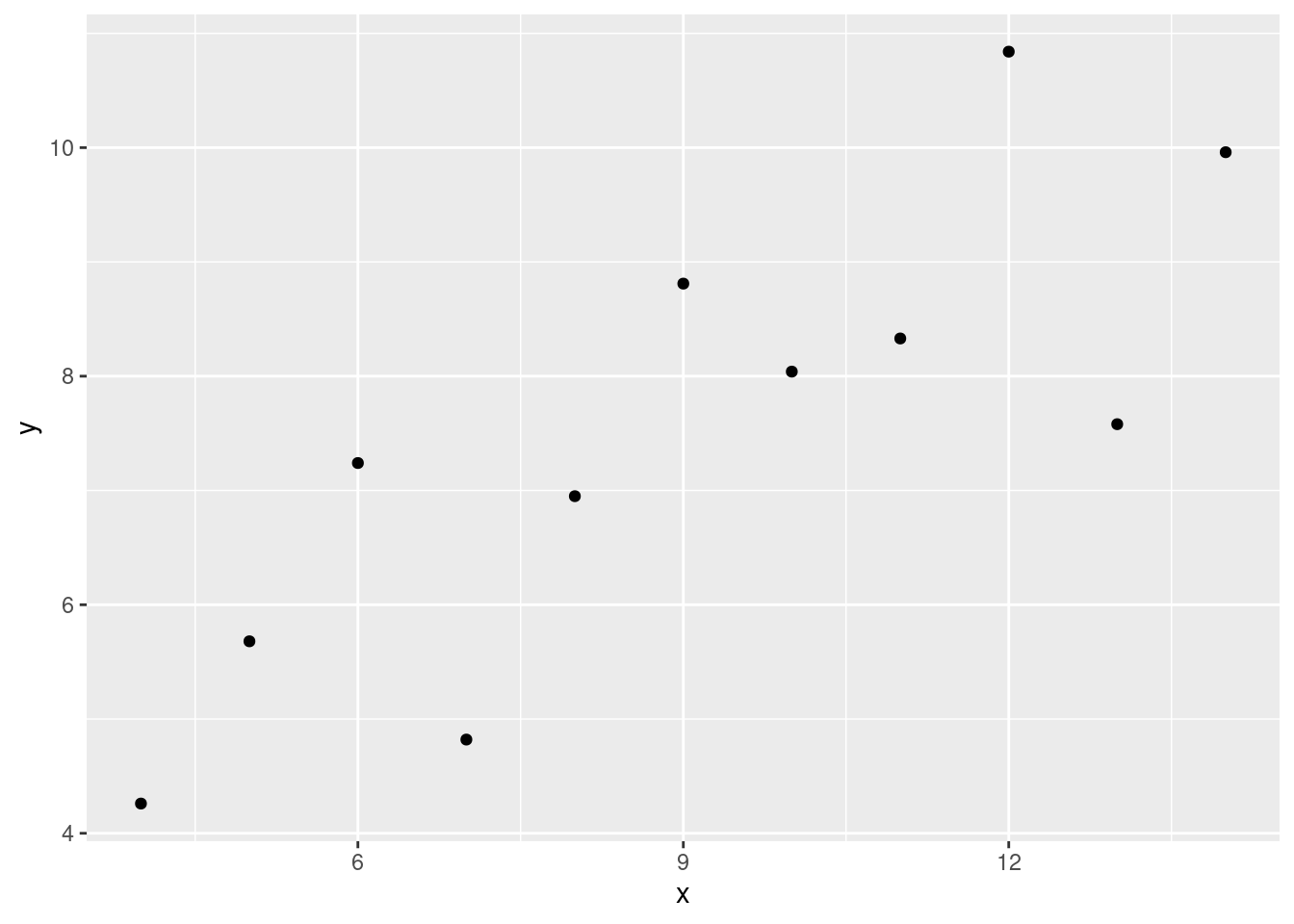
The data set that we passed to the data parameter
doesn’t have the information on the model, so we have to add this
information. For a linear model, we are most interested in the
coefficients for the slope and the intercept. We can extract those
estimates from our model fit by using the function
coef.
coef(fit)## (Intercept) x
## 3.0000909 0.5000909The function coef returns a vector of numeric values.
For this model, where we have a single predictor variable, we expect to
have two coefficients: the intercept and the slope for “x”. So, we
should have a vector of length 2.
length(coef(fit))## [1] 2Remember that you can get the nth value in a vector by
using the square brackets and using the square brackets:
vect <- c(54, 32, 94, 12) # vector of length 4
vect[2] # get the 2nd element in the vector
## [1] 32vect[4] # get the 4th element in the vector## [1] 12We can do the same with the coef function:
coef_vector <- coef(fit)
coef_vector[1] # the intercept
## (Intercept)
## 3.000091coef_vector[2] # the slope for x## x
## 0.5000909Because coef() returns a named vector,
we can access its contents by using the actual names of the
coefficients. Generally speaking, this is a much safer option. Let’s go
ahead and store the intercept and slope into separate variables.
(intercept <- coef_vector["(Intercept)"]) # parentheses around an assignment expression will perform assignment and then print the contents of the assigned object## (Intercept)
## 3.000091(slopex <- coef_vector["x"])## x
## 0.5000909Important
When you are trying to extract a value in a vector, a list, a matrix,
a data frame, etc it can often be risky to use a numeric index. When
analyzing data, you often aren’t necessarily interested in the 3rd
element in a list, or the 6th column in a data frame. You are more
likely to be interested in subject CT004’s score, or the column
“weight”, for instance. If a numeric index is not inherent to the
measure of interest, it’s possible the number could change. You could
add a column in your data set and now weight is no longer the 6th column
but the 7th. If your code has something like df[,6] you may
no longer be analyzing weight, but whatever column was inserted. This is
a type of error that is completely opposite to “fail hard and fail
fast”; these types of errors are really tough to notice and the computer
has no reason to think it’s an error. In the model that we fit above,
what if we added a predictor so that our model was now
y ~ x1 + x? Now coef_vector[2] refers to the
estimate for x1 and not for x.
coef_vector["x"] would refer to the estimate for the
coefficient “x” no matter what other variables are added to the
model.
TMI
You can skip the intermediate step of creating the
coef_vector object by indexing directly on the function
call.
(intercept <- coef(fit)["(Intercept)"])## (Intercept)
## 3.000091(slopex <- coef(fit)["x"])## x
## 0.5000909ggplot(data = set1_data, aes(x = x, y = y))+
geom_point()+
geom_abline(slope = slopex, intercept = intercept)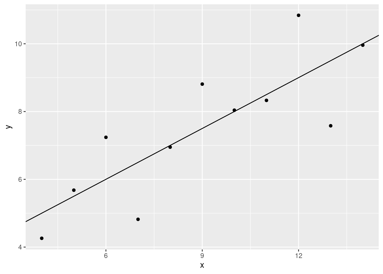
This looks like a pretty decent fit.
TMI
Note!: We are walking through each line of this plot so that you can
see what each layer/line of code does. By using the +
operator, the lines of code are chained together. If we want to end up
with the plot above, we wouldn’t need to run the code for the previous
plots separately.
Let’s check out the second data set.
DIY: Anscombe data set 2
Check 1
Check your understanding
- First, take the data set named
anscombeand filter the data so that only the rows from set 2 are returned. Assign the filtered data to a variable calledset2_data. Do all of this in the code chunk below.
## WRITE YOUR CODE HERE!
#
#
#
#
#
#- Go ahead and fit the model so that you can extract the estimates for
the slope and intercept. Store the output of the
lmfunction in a variable calledfit.
### YOUR CODE HERE
#
#
#
#
#
#- Use the function
coefto extract the intercept and the slope from the model fit. You should assign the value for the intercept to an object namedinterceptand the coefficient for “x” to an object namedslopex.
### YOUR CODE HERE
#
#
#
#
#
#- Now, make a plot of the data with the regression line running through the data
### YOUR CODE HERE
#
#
#
#
#
#
How does the plot look? Does the regression line look like it fits? How much confidence do you have in the model fit?
Check 2
Go ahead and plot set 3 and 4. (You can fit a linear model if you want, or you can just use the fit from the last data set. We’ve already seen that the intercepts and slopes are close to the same - at least for our purposes.)
- Set 3.
### YOUR CODE HERE
#
#
#
#
#
#- Set 4.
### YOUR CODE HERE
#
#
#
#
#
#
All of the Anscombe data sets
By now, you should have noticed that these data sets are quite different, even though many of our statistical summaries/models suggested that they were the same.
ans_plot <- ggplot(data = anscombe, aes(x = x, y = y)) + # plots can be stored in variables as well
  geom_point() +
  facet_wrap(~set) # a ggplot2 function that allows multi-panel plots
ans_plot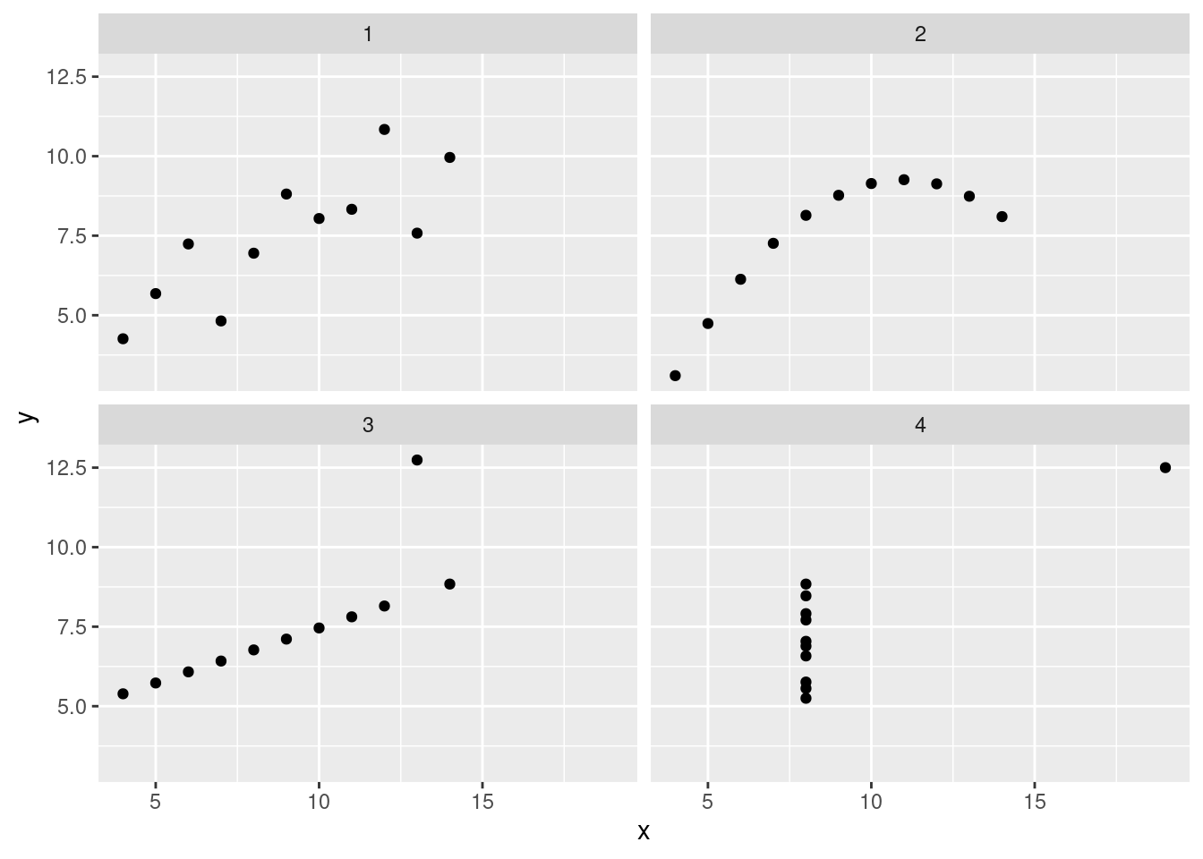
These data look pretty distinct. If we add a regression line (slope and intercept), we see that the lines are the same.
ans_plot +
   geom_smooth(formula = y ~ x, method = "lm", se = FALSE, data = anscombe) # ggplot2 even has some modelling functions; these are good for doing quick exploratory work but I wouldn't rely on them too much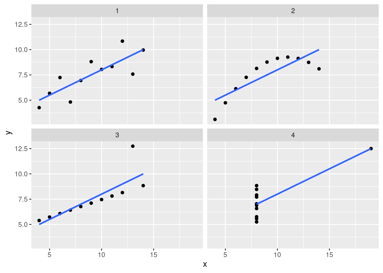
You should always plot your data! Linear regression, the mean, the median, standard deviation, etc are all models and, as such, necessarily simplify your data. Plotting can help you better understand if that simplification is actually useful.
Important
You should always plot your data. However, when you plot your data depends on the type of research you are doing. By that, I mean whether you are generating hypotheses or whether you are testing a hypothesis.
Visualizing your data before deciding on the type of model to fit is necessary if you are doing exploratory work. BUT! If you have a hypothesis that you are testing, you should hold off until after running your hypothesis tests (fitting your models, doing inferential stats, etc). At the very least, you should not adapt your hypothesis after plotting the data.
Why? Every sample is going to have some weirdness associated with it. If you notice an interesting relationship in a sample and you want to test if that relationship can be generalized to the whole population, you can’t test on that original sample. There is no way to know if that relationship was just a quirk of the original data set or if it is, in fact, true of the whole population. In (frequentist) hypothesis testing, you are testing how likely it is that your sample data could have occurred by chance alone. If you plot your data and then modify your hypothesis based on what you see, your hypothesis is no longer independent of that particular sample. So, you can’t assess how likely your data is from chance. This increases the chances of false positives (Type I errors).
For a better explanation, check out Ben Bolker’s answer on CrossValidated to the following question: Performing a statistical test after visualizing data - data dredging?. (Ben Bolker is the author of Ecological modeling and Data in R and is a very reliable source on statistical modeling.)
ggplot2
Let’s go back over some ggplot concepts in more details. We’ll use
the starwars data set.
data("starwars")When you load or read in a data set, remember to do a few checks to make sure everything loaded properly
head(starwars)## # A tibble: 6 × 14
## name height mass hair_…¹ skin_…² eye_c…³ birth…⁴ sex gender homew…⁵
## <chr> <int> <dbl> <chr> <chr> <chr> <dbl> <chr> <chr> <chr>
## 1 Luke Skywal… 172 77 blond fair blue 19 male mascu… Tatooi…
## 2 C-3PO 167 75 <NA> gold yellow 112 none mascu… Tatooi…
## 3 R2-D2 96 32 <NA> white,… red 33 none mascu… Naboo
## 4 Darth Vader 202 136 none white yellow 41.9 male mascu… Tatooi…
## 5 Leia Organa 150 49 brown light brown 19 fema… femin… Aldera…
## 6 Owen Lars 178 120 brown,… light blue 52 male mascu… Tatooi…
## # … with 4 more variables: species <chr>, films <list>, vehicles <list>,
## # starships <list>, and abbreviated variable names ¹hair_color, ²skin_color,
## # ³eye_color, ⁴birth_year, ⁵homeworldThe function glimpse in the package dplyr
is really helpful. (Base R str is also good, but I find
that glimpse is a bit easier to read.)
glimpse(starwars)## Rows: 87
## Columns: 14
## $ name <chr> "Luke Skywalker", "C-3PO", "R2-D2", "Darth Vader", "Leia Or…
## $ height <int> 172, 167, 96, 202, 150, 178, 165, 97, 183, 182, 188, 180, 2…
## $ mass <dbl> 77.0, 75.0, 32.0, 136.0, 49.0, 120.0, 75.0, 32.0, 84.0, 77.…
## $ hair_color <chr> "blond", NA, NA, "none", "brown", "brown, grey", "brown", N…
## $ skin_color <chr> "fair", "gold", "white, blue", "white", "light", "light", "…
## $ eye_color <chr> "blue", "yellow", "red", "yellow", "brown", "blue", "blue",…
## $ birth_year <dbl> 19.0, 112.0, 33.0, 41.9, 19.0, 52.0, 47.0, NA, 24.0, 57.0, …
## $ sex <chr> "male", "none", "none", "male", "female", "male", "female",…
## $ gender <chr> "masculine", "masculine", "masculine", "masculine", "femini…
## $ homeworld <chr> "Tatooine", "Tatooine", "Naboo", "Tatooine", "Alderaan", "T…
## $ species <chr> "Human", "Droid", "Droid", "Human", "Human", "Human", "Huma…
## $ films <list> <"The Empire Strikes Back", "Revenge of the Sith", "Return…
## $ vehicles <list> <"Snowspeeder", "Imperial Speeder Bike">, <>, <>, <>, "Imp…
## $ starships <list> <"X-wing", "Imperial shuttle">, <>, <>, "TIE Advanced x1",…If you’ve read any of the other documents on the webpage, you’ll remember those last three columns are a bit weird. We don’t really want to have to deal with columns of lists and we don’t need that data any way, so we’ll drop those three columns.
# here we're using dplyr to clean up the data set
starwars <-
    starwars |>
    select(-(films:starships))
head(starwars)
## # A tibble: 6 × 11
## name height mass hair_…¹ skin_…² eye_c…³ birth…⁴ sex gender homew…⁵
## <chr> <int> <dbl> <chr> <chr> <chr> <dbl> <chr> <chr> <chr>
## 1 Luke Skywal… 172 77 blond fair blue 19 male mascu… Tatooi…
## 2 C-3PO 167 75 <NA> gold yellow 112 none mascu… Tatooi…
## 3 R2-D2 96 32 <NA> white,… red 33 none mascu… Naboo
## 4 Darth Vader 202 136 none white yellow 41.9 male mascu… Tatooi…
## 5 Leia Organa 150 49 brown light brown 19 fema… femin… Aldera…
## 6 Owen Lars 178 120 brown,… light blue 52 male mascu… Tatooi…
## # … with 1 more variable: species <chr>, and abbreviated variable names
## # ¹hair_color, ²skin_color, ³eye_color, ⁴birth_year, ⁵homeworldglimpse(starwars)## Rows: 87
## Columns: 11
## $ name <chr> "Luke Skywalker", "C-3PO", "R2-D2", "Darth Vader", "Leia Or…
## $ height <int> 172, 167, 96, 202, 150, 178, 165, 97, 183, 182, 188, 180, 2…
## $ mass <dbl> 77.0, 75.0, 32.0, 136.0, 49.0, 120.0, 75.0, 32.0, 84.0, 77.…
## $ hair_color <chr> "blond", NA, NA, "none", "brown", "brown, grey", "brown", N…
## $ skin_color <chr> "fair", "gold", "white, blue", "white", "light", "light", "…
## $ eye_color <chr> "blue", "yellow", "red", "yellow", "brown", "blue", "blue",…
## $ birth_year <dbl> 19.0, 112.0, 33.0, 41.9, 19.0, 52.0, 47.0, NA, 24.0, 57.0, …
## $ sex <chr> "male", "none", "none", "male", "female", "male", "female",…
## $ gender <chr> "masculine", "masculine", "masculine", "masculine", "femini…
## $ homeworld <chr> "Tatooine", "Tatooine", "Naboo", "Tatooine", "Alderaan", "T…
## $ species <chr> "Human", "Droid", "Droid", "Human", "Human", "Human", "Huma…The basic syntax of ggplot2 typically requires an
argument for your data, data = and an aesthetic argument
aes(). Within the aes() argument, you will
specify the data that you want to visualize.
ggplot(data = starwars, aes(x = height, y = mass))
You’ll notice that there are axis labels and the ranges match with our data but the data doesn’t appear in the plot. If you subset the data, you’ll notice that the ranges change (the data still doesn’t show).
sw_human_data <-
  starwars |>
  filter(species == "Human")

ggplot(data = sw_human_data, aes(x = height, y = mass))
The data does not appear because ggplot2 does not assume
the type of plot you want, so you must specify this information. You can
do this by using the operator + and functions which usually
start with geom_. For example, for scatter plots use
geom_point(), for boxplots use geom_boxplot(),
for a histogram geom_histogram().
ggplot(data = sw_human_data, aes(x = height, y = mass)) +
  geom_point()
## Warning: Removed 13 rows containing missing values (geom_point).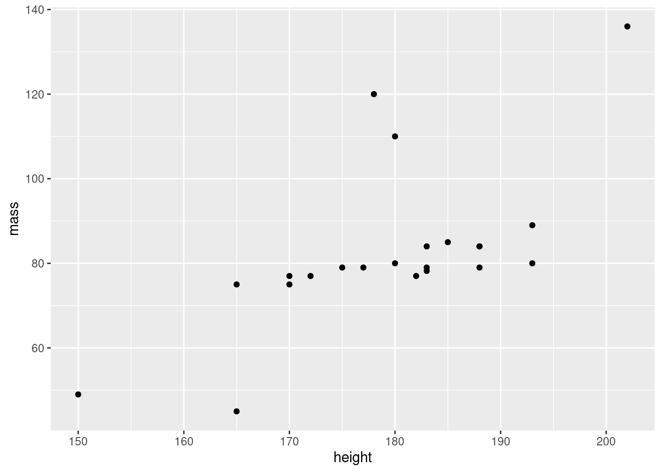
ggplot(data = sw_human_data, aes(x = gender, y = height)) +
  geom_boxplot()
## Warning: Removed 4 rows containing non-finite values (stat_boxplot).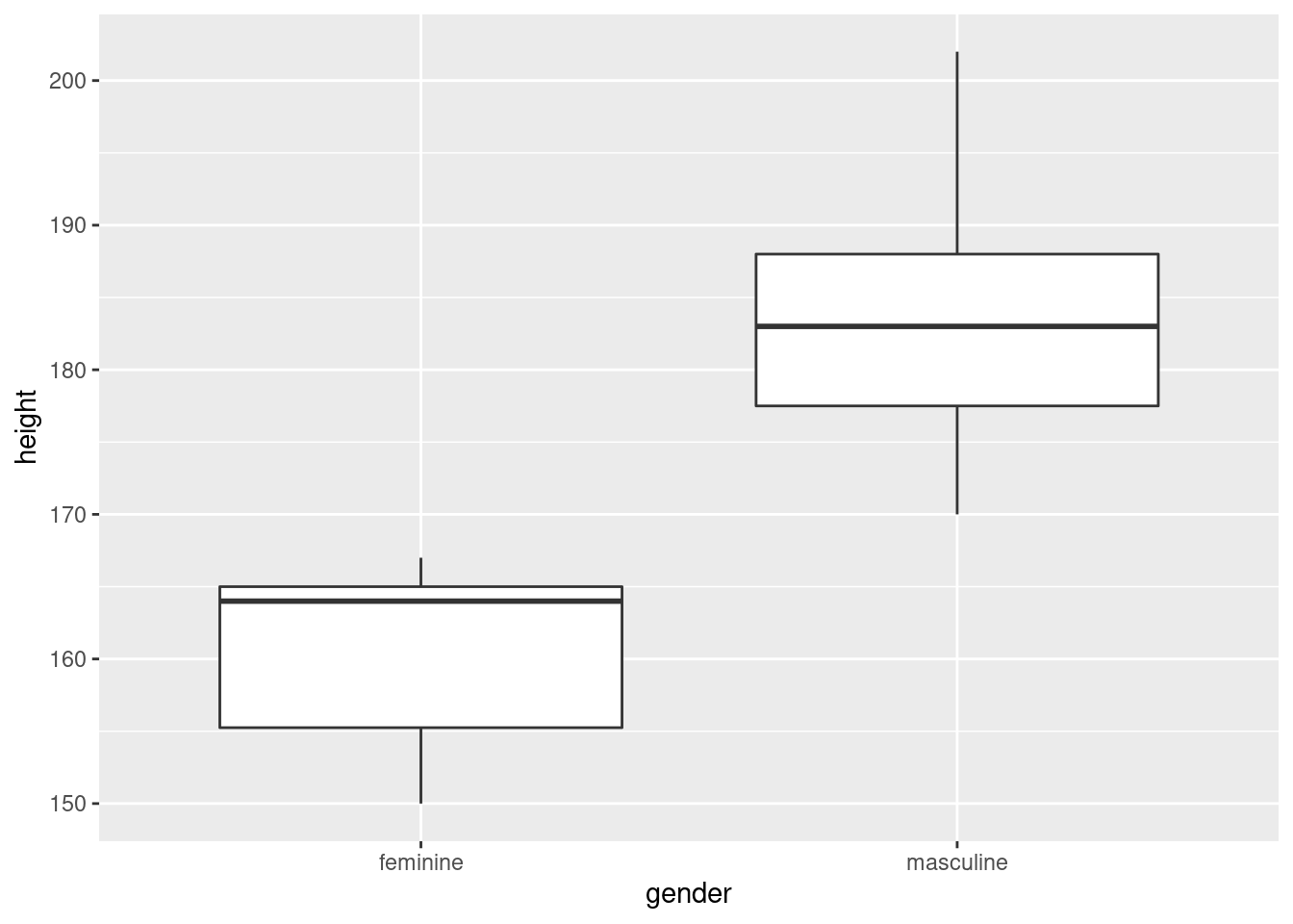
ggplot(data = sw_human_data, aes(x = height)) +
  geom_histogram()
## `stat_bin()` using `bins = 30`. Pick better value with `binwidth`.## Warning: Removed 4 rows containing non-finite values (stat_bin).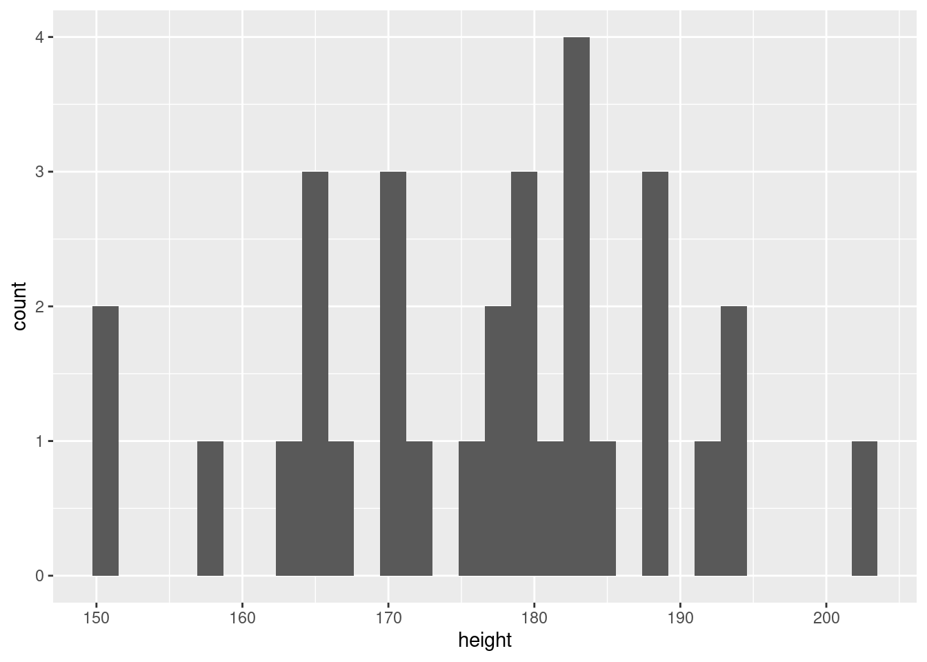
(Note: There are NAs in this data set. ggplot2 will
remove them by default but produces a warning message - “removed n rows
containing non-finite values”; “removed n rows containing missing
values”. Be careful, though, ggplot2 will use the same
warning message if it removes data because of NAs or if it removes them
because the axes are mis-specified. If you get this message make sure
you know why it is being produced.)
These plots are pretty basic and do not have titles or useful axis labels, but ggplot2 gives you tons of flexibility in adjusting your plots. Let’s start with some scatter plots.
Scatter plots
First, let’s modify the axis and title labels:
ggplot(data = sw_human_data, aes(x = height, y = mass)) +
  geom_point() +
  labs(title = "Human height and mass in the Star Wars universe", x = "Height (cm)", y = "Mass (kg)")
## Warning: Removed 13 rows containing missing values (geom_point).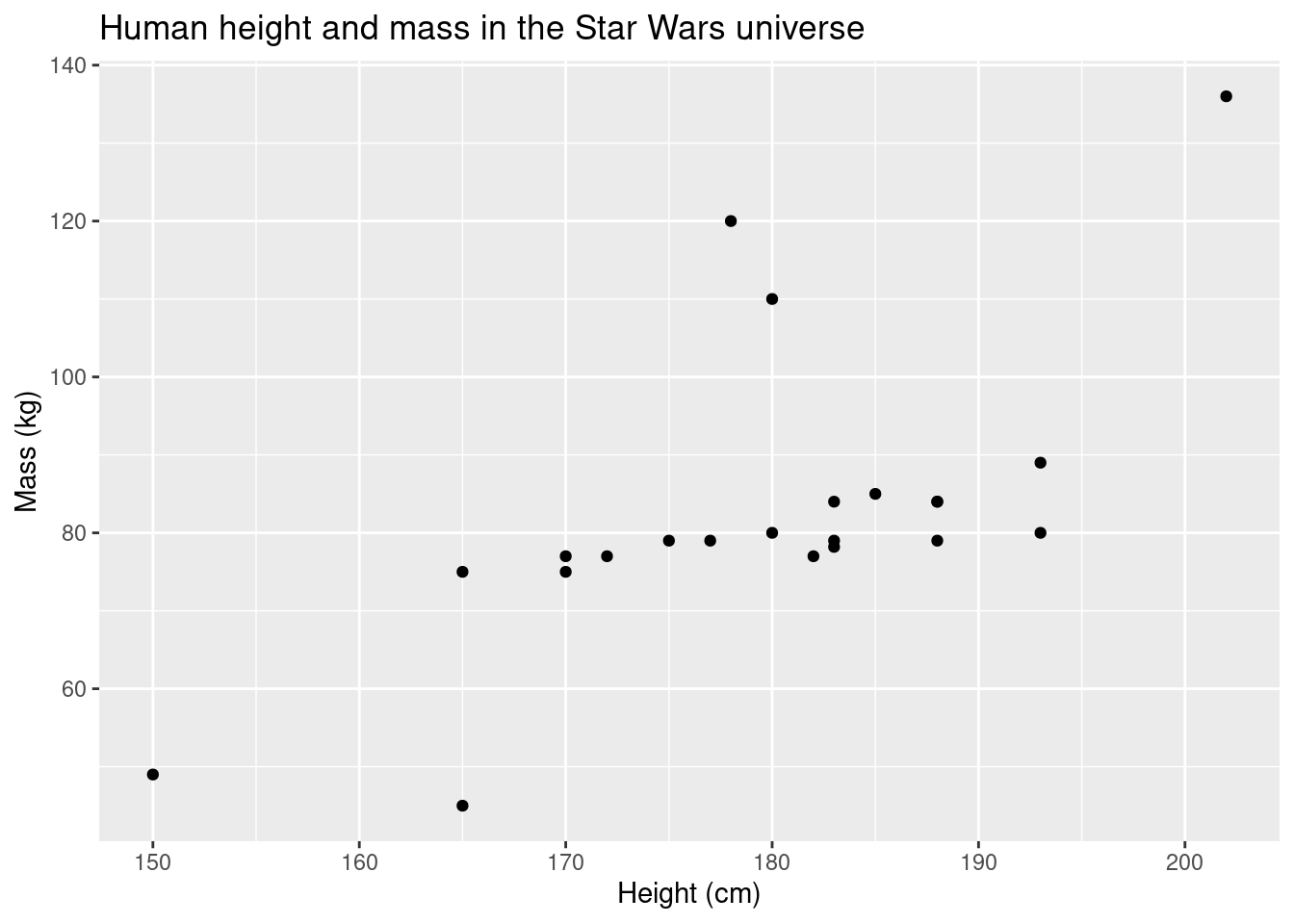
We can also modify how the points appear by adjusting the parameters
in geom_point()
ggplot(data = sw_human_data, aes(x = height, y = mass)) +
  geom_point(size = 5, shape = 17, color = "red") +
  labs(title = "Human height and mass in the Star Wars universe", x = "Height (cm)", y = "Mass (kg)")
## Warning: Removed 13 rows containing missing values (geom_point).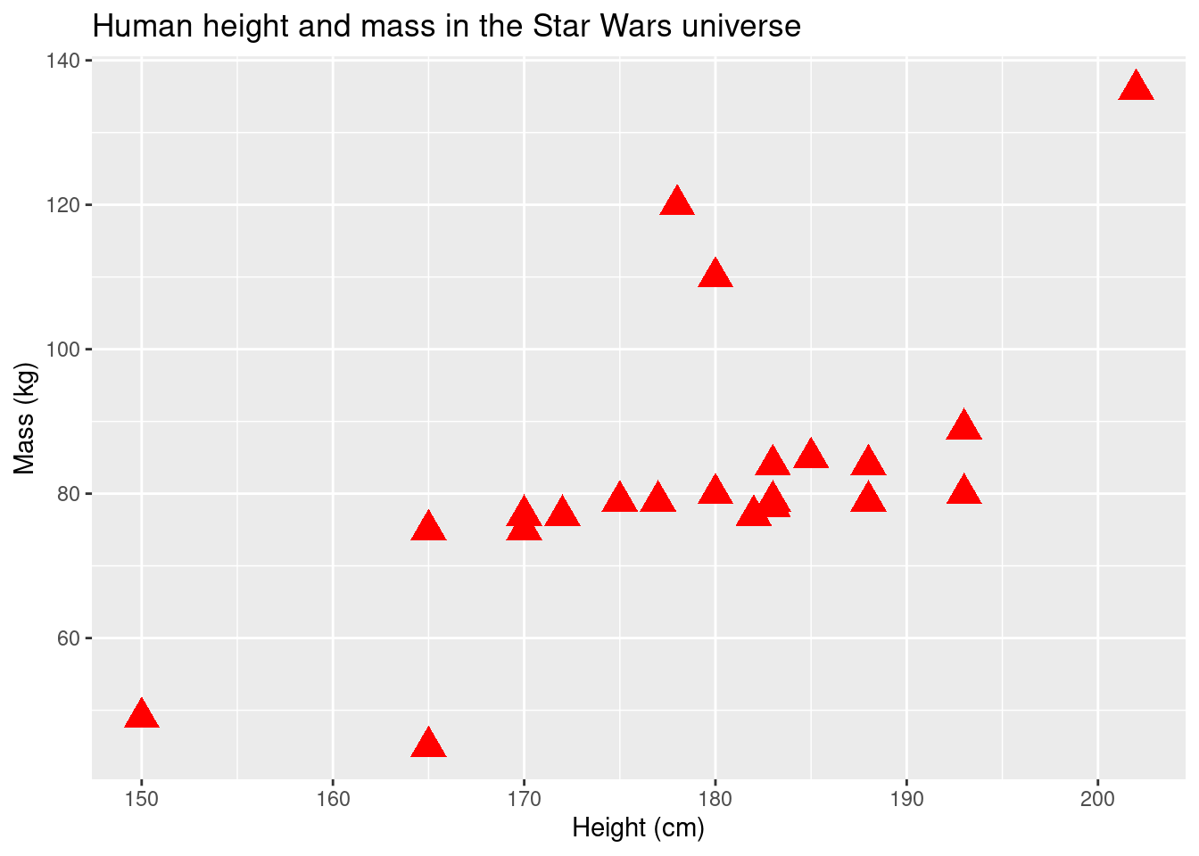
What if we want to look at how height and mass break down by group?
ggplot(data = sw_human_data, aes(x = height, y = mass, color = eye_color)) +
  geom_point(size = 5) +
  labs(title = "Human height and mass in the Star Wars universe", x = "Height (cm)", y = "Mass (kg)")
## Warning: Removed 13 rows containing missing values (geom_point).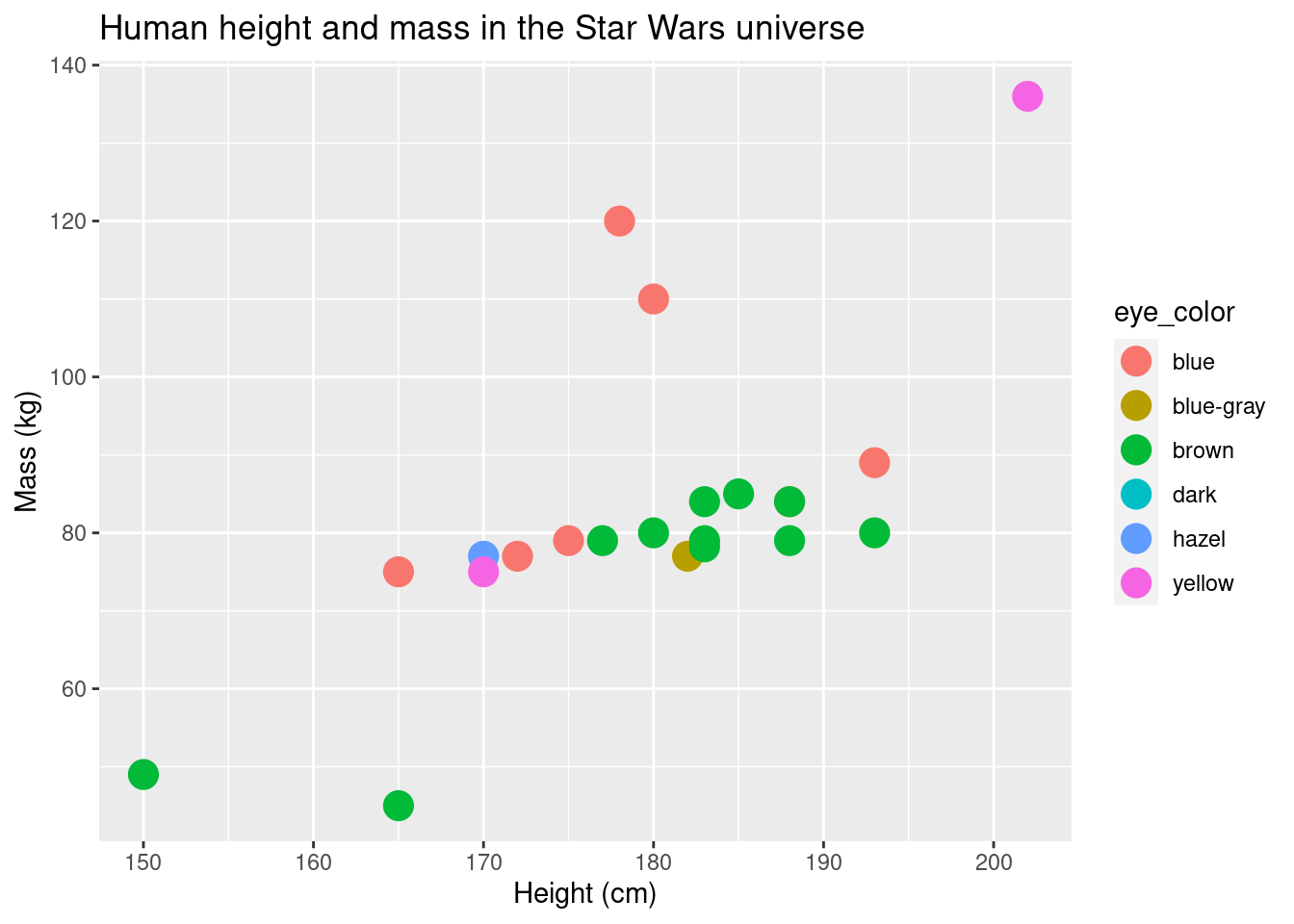
There are two important things to note about this plot.
First, compare how we specified the point colors in this plot vs the
one preceding it. In the first, color is specified in the
geom_point layer. In the second, it’s specified in the
initial layer, as part of the aes function. It obviously
has a pretty significant effect on the plot. The function
aes maps data onto the aesthetic properties of a
layer/geom. If it is specified in the very first layer, the mapping is
used throughout all of the layers (until and unless it is overridden).
If color is specified outside of aes, color is only defined
for that particular layer. Also, it is more of a property of the geom
rather than the data-geom mapping. Color is not the only property that
works like this. You can specify fill, shape,
size, among others as properties of the geom or the
geom-data mapping.
ggplot(data = sw_human_data, aes(x = height, y = mass, shape = eye_color)) +
  geom_point(size = 5) +
  labs(title = "Human height and mass in the Star Wars universe", x = "Height (cm)", y = "Mass (kg)")
## Warning: Removed 13 rows containing missing values (geom_point).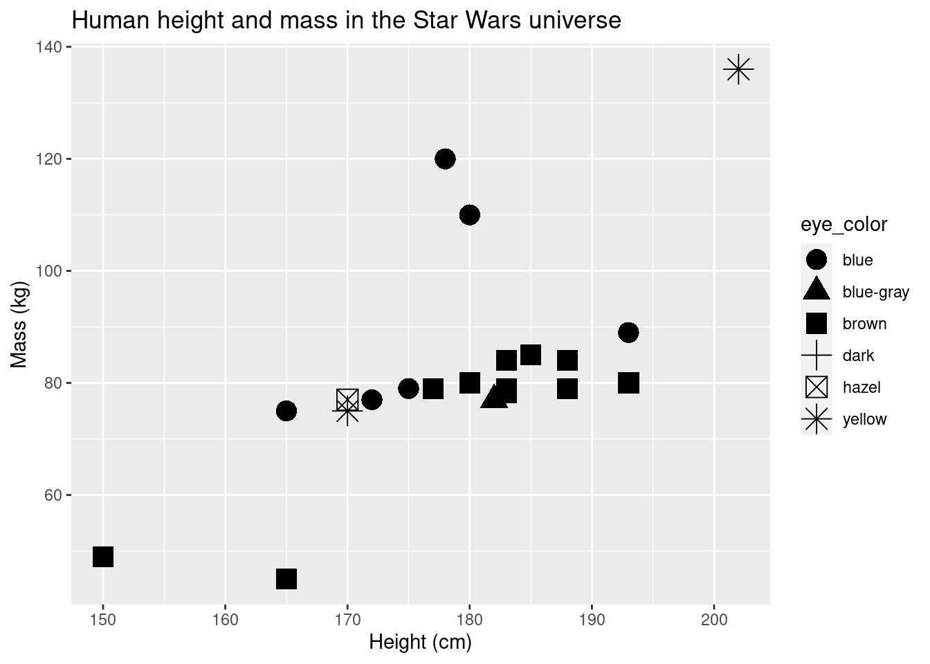
ggplot(data = sw_human_data, aes(x = height, y = mass, size = eye_color)) +
  geom_point() +
  labs(title = "Human height and mass in the Star Wars universe", x = "Height (cm)", y = "Mass (kg)")
## Warning: Using size for a discrete variable is not advised.## Warning: Removed 13 rows containing missing values (geom_point).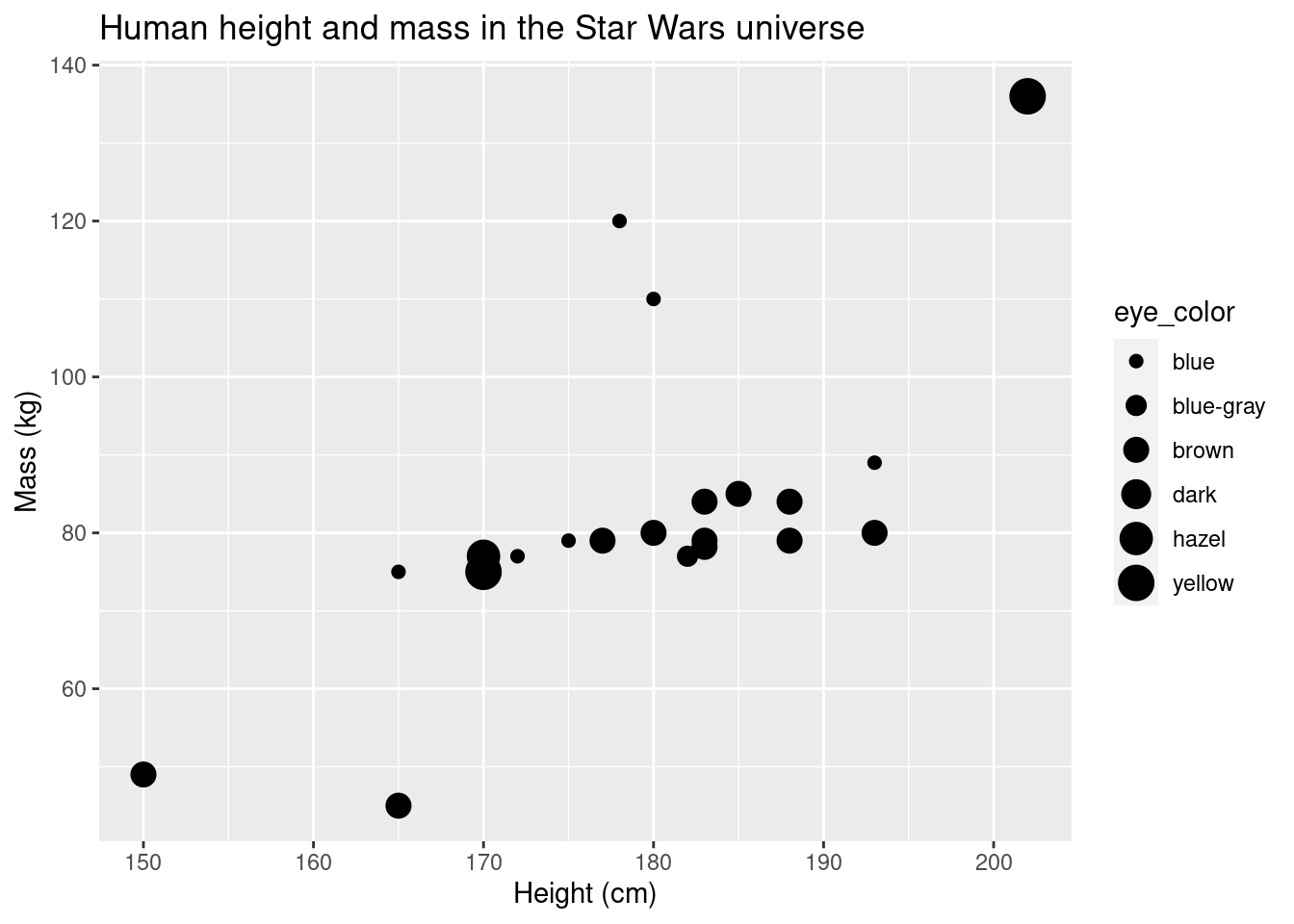
Check your understanding
Check 3
What do you think would happen if we had left size = 5
in the geom_point() layer? Why do you think that?
The aesthetic mapping can be defined in the initial layer or in a later geom layer. This could be helpful if you have multiple geom layers (e.g., points overlaid over box plots) and you want color to map different in the geom layers.
ggplot(data = sw_human_data, aes(x = height, y = mass)) +
  geom_point(aes(color = eye_color), size = 5) +
  labs(title = "Human height and mass in the Star Wars universe", x = "Height (cm)", y = "Mass (kg)")
## Warning: Removed 13 rows containing missing values (geom_point).
The second thing you should note about the plot, is that it’s pretty
confusing The colors in the plot don’t match the eye color. While this
probably won’t be a problem you encounter often, specifying colors
manually can be quite useful. Functions which give you more control over
the colors or shapes of points typically start with scale_
(e.g., scale_fill_manual(),
scale_color_continuous(),
scale_shape_discrete()).
R uses hexadecimal to represent colors. You can look up the hex values, but R also has hundreds of built-in color names. You can find those color names here: “http://www.stat.columbia.edu/~tzheng/files/Rcolor.pdf”
TMI
Note: No need to worry too much about ‘hexadecimal’. If you are interested, it is a base-16 numerical system. Each color is represented by a hashtag followed by 6 characters; 2 characters representing the amount of red, 2 for green, and 2 for blue.
ggplot(data = sw_human_data, aes(x = height, y = mass, color = eye_color)) +
  geom_point(size = 5) +
  scale_color_manual(values = c("blue", "lightblue", "tan", "tan4", "forestgreen", "yellow")) +
  labs(title = "Human height and mass in the Star Wars universe", x = "Height (cm)", y = "Mass (kg)")
## Warning: Removed 13 rows containing missing values (geom_point).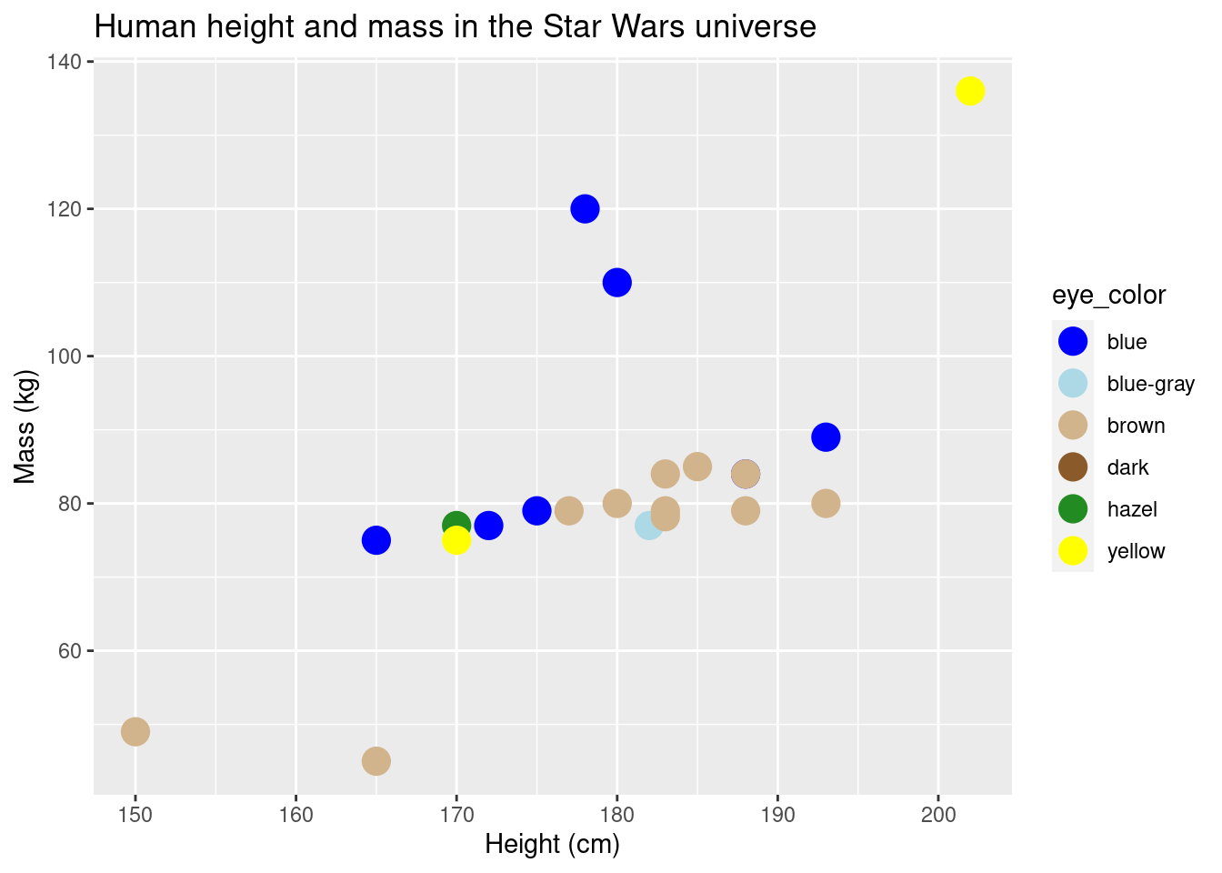
You can also change the colors without specifying colors manually.
This is useful if you don’t need to specify exactly which colors go with
with group, but you need a different color palette than the default. By
using a palette you can improve the look of your graphs relatively
easily. Some journals have color preferred color palettes. You can also
make your graphs color-blind friendly. The package
RColorBrewer has created palettes that are compatible with
ggplot2 and contain metadata which let you know if the
palette is color-blind friendly or not.
head(brewer.pal.info, 10)## maxcolors category colorblind
## BrBG 11 div TRUE
## PiYG 11 div TRUE
## PRGn 11 div TRUE
## PuOr 11 div TRUE
## RdBu 11 div TRUE
## RdGy 11 div FALSE
## RdYlBu 11 div TRUE
## RdYlGn 11 div FALSE
## Spectral 11 div FALSE
## Accent 8 qual FALSEggplot(data = sw_human_data, aes(x = height, y = mass, color = eye_color)) +
geom_point(size = 5) +
scale_colour_brewer(palette = "RdYlBu") +
labs(title = "Human height and mass in the Star Wars universe", x = "Height (cm)", y = "Mass (kg)")## Warning: Removed 13 rows containing missing values (geom_point).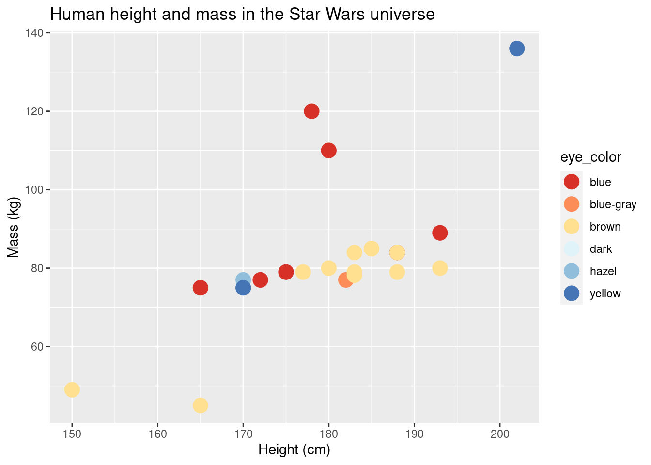
What happens if you have an outlier?
ggplot(data = starwars, aes(x = height, y = mass)) +
  geom_point(size = 2) +
  scale_colour_brewer(palette = "RdYlBu") +
  labs(title = "Height and mass in the Star Wars universe", x = "Height (cm)", y = "Mass (kg)")
## Warning: Removed 28 rows containing missing values (geom_point).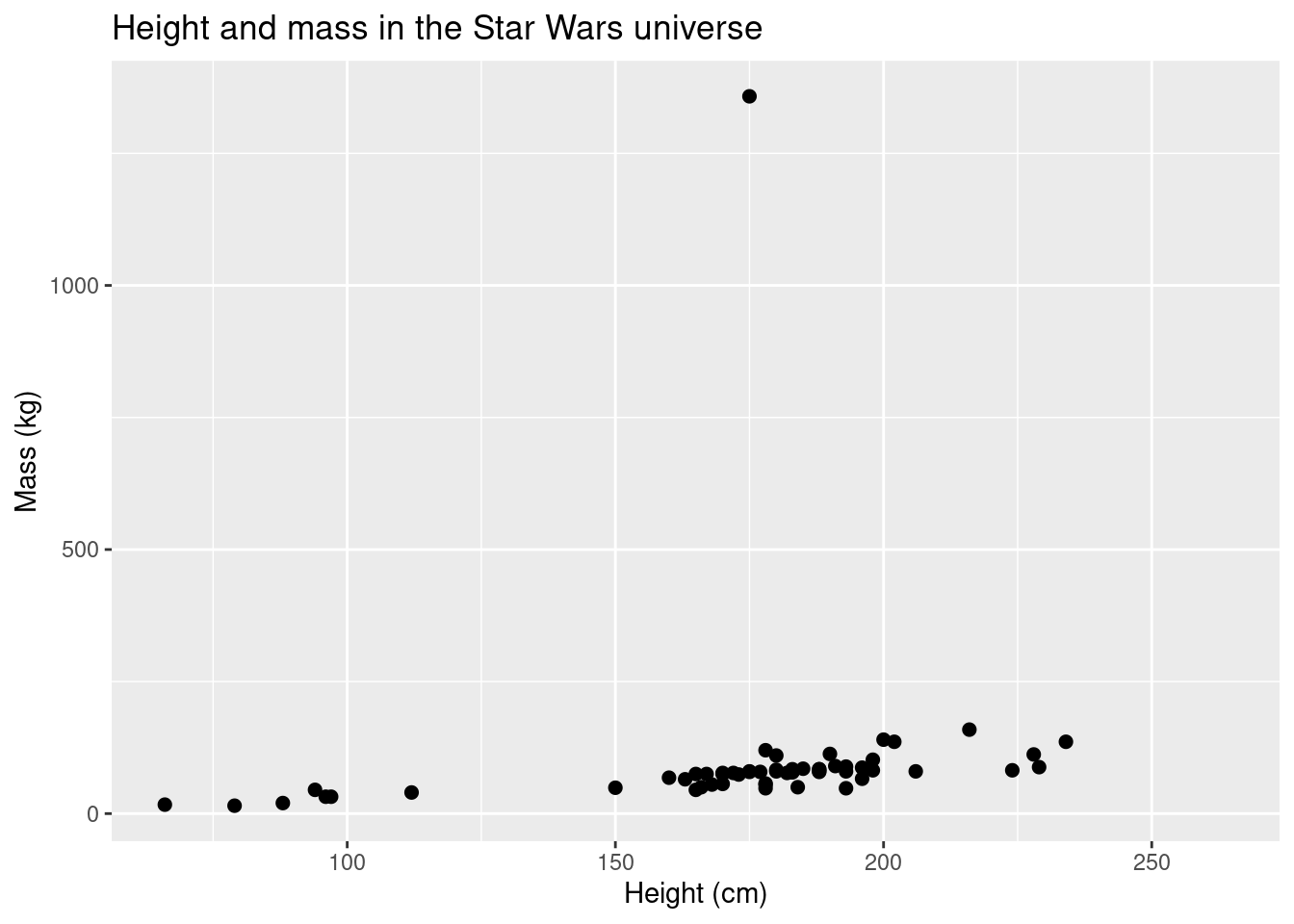
You can change the axes on your plot. However, be careful, some methods could have unintended consequences. Let’s look at an example:
ggplot(data = starwars, aes(x = height, y = mass)) +
  geom_point(size = 2) +
  scale_colour_brewer(palette = "RdYlBu") +
  labs(title = "Height and mass in the Star Wars universe", subtitle = "x and y limits changed", x = "Height (cm)", y = "Mass (kg)") +
  ylim(c(0,200)) +
  xlim(c(0,250))
## Warning: Removed 29 rows containing missing values (geom_point).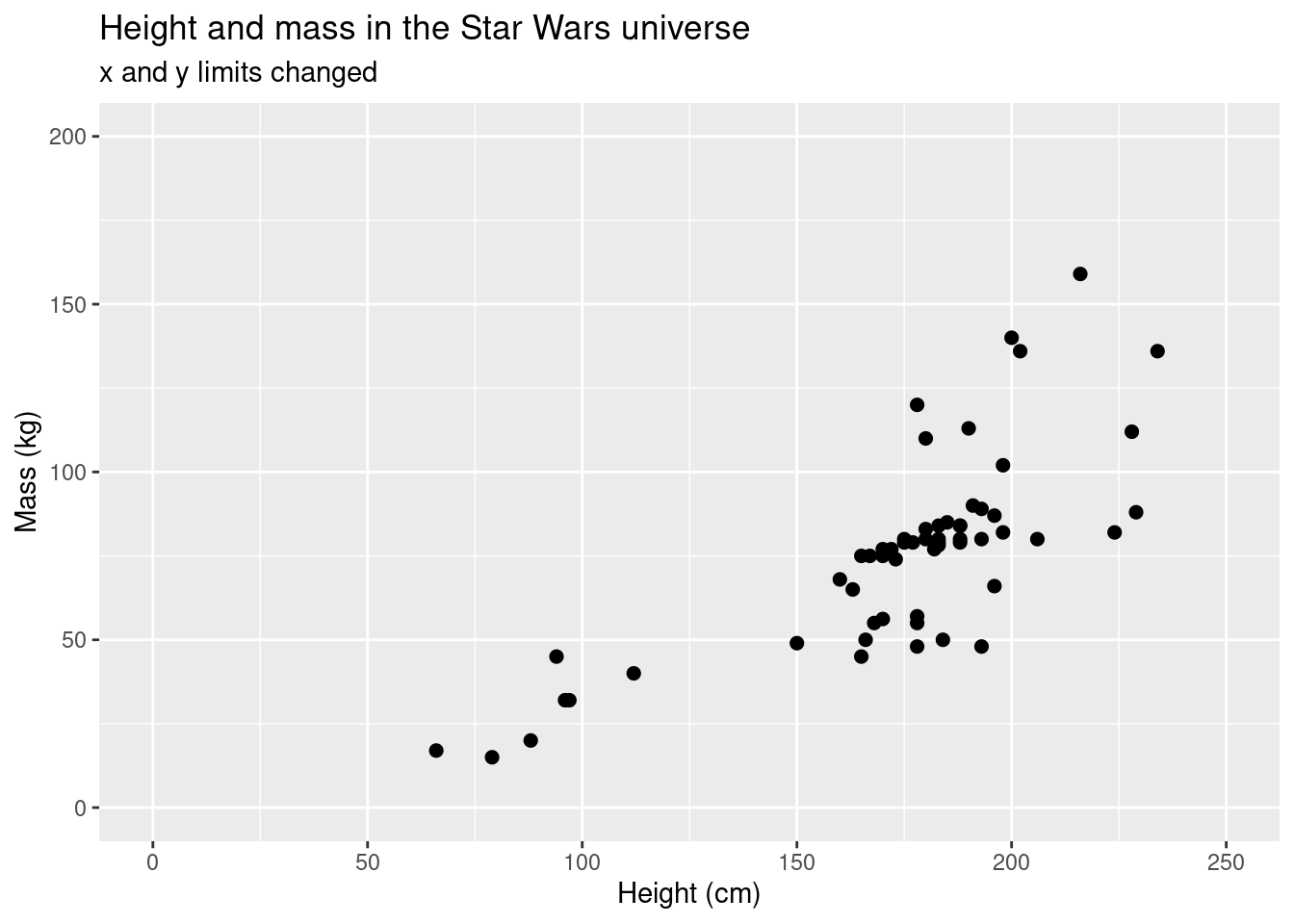
If we remove the really heavy individual, we can see the height-mass relationship a bit better. We can apply a data smoothing function that will give you a linear regression line with confidence intervals.
ggplot(data = starwars, aes(x = height, y = mass)) +
  geom_point(size = 2) +
  scale_colour_brewer(palette = "RdYlBu") +
  labs(title = "Height and mass in the Star Wars universe", subtitle = "x and y limits changed", x = "Height (cm)", y = "Mass (kg)") +
  ylim(c(0,200)) +
  xlim(c(50,250)) +
  geom_smooth(method = 'lm')
## `geom_smooth()` using formula 'y ~ x'## Warning: Removed 29 rows containing non-finite values (stat_smooth).## Warning: Removed 29 rows containing missing values (geom_point).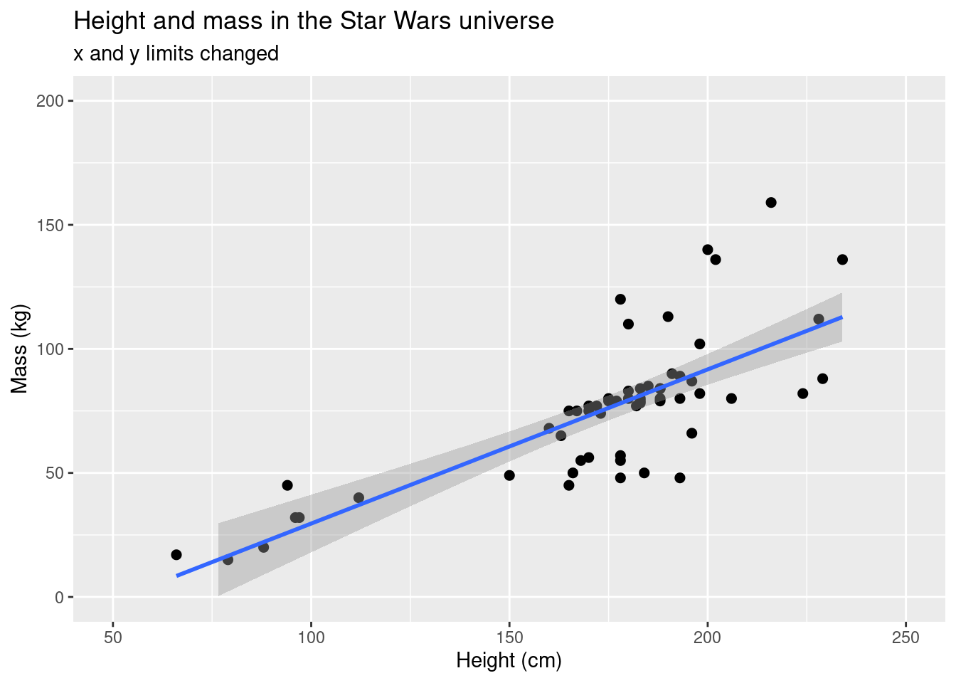
However, the model only applies the linear model calculation to the
data points that actually appear. If we use
coord_cartesian() around xlim() and
ylim(), we’ll see a big difference.
ggplot(data = starwars, aes(x = height, y = mass)) +
  geom_point(size = 2) +
  scale_colour_brewer(palette = "RdYlBu") +
  labs(title = "Height and mass in the Star Wars universe", subtitle = "x and y limits changed using coord_cartesian", x = "Height (cm)", y = "Mass (kg)") +
  coord_cartesian(xlim = c(50, 250),
                  ylim = c(0, 200)) +
  stat_smooth(method = 'lm')
## `geom_smooth()` using formula 'y ~ x'## Warning: Removed 28 rows containing non-finite values (stat_smooth).## Warning: Removed 28 rows containing missing values (geom_point).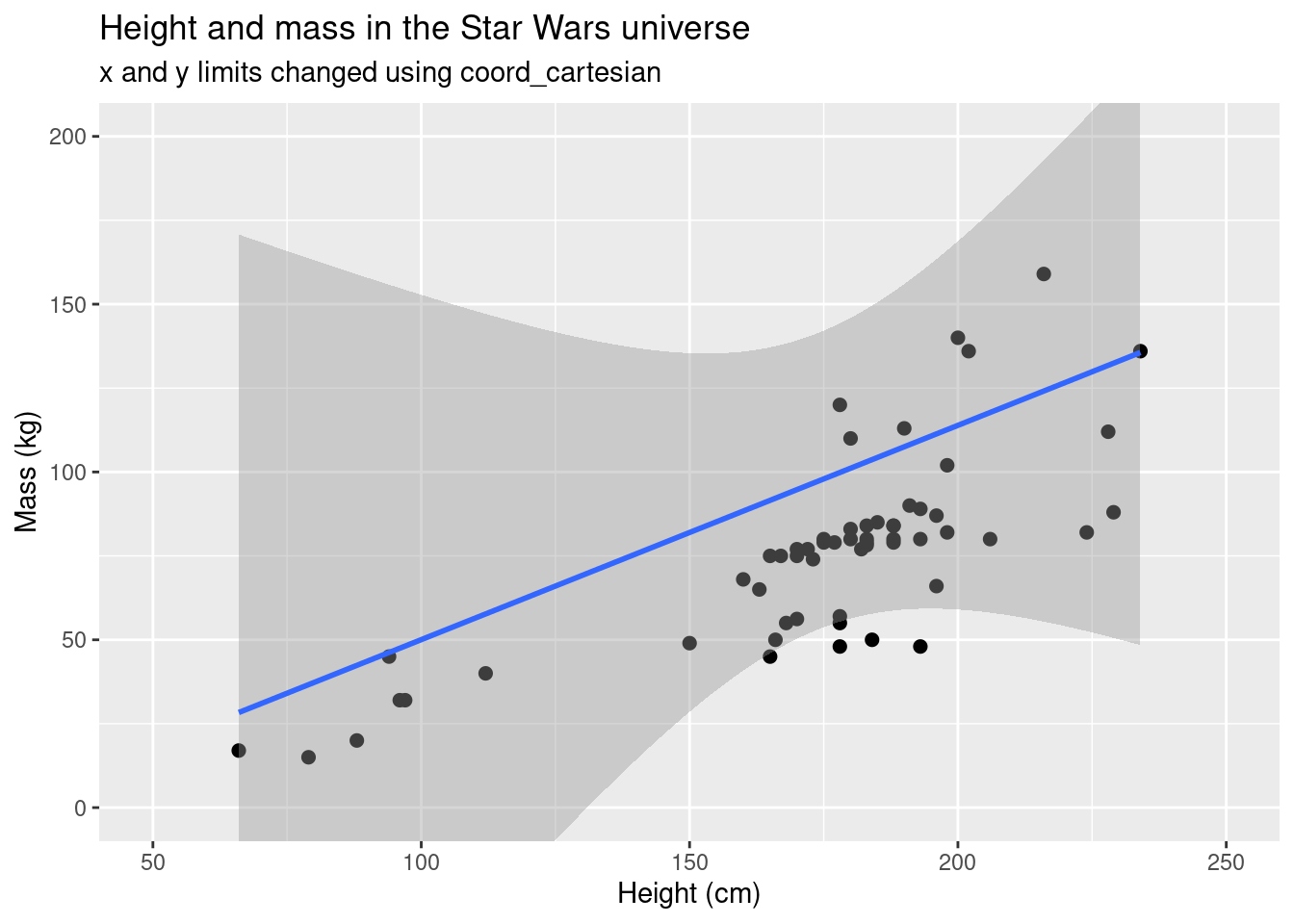
Notice how the slope and intercept are different in the two plots and
the grey area (the confidence interval) is much larger in the second
plot. The function coord_cartesian() calculates based on
the data in the data frame, not the data that is plotted.
coord_cartesian() basically zooms into the data, while
xlim() and ylim() by themselves subset the
data area. You might not use the geom_smooth() function
much, but you will likely use geom_boxplot().
median_human_height_gender <- tapply(sw_human_data$height, sw_human_data$gender, median, na.rm = TRUE)

ggplot(data = sw_human_data, aes(x = gender, y = height)) +
  geom_boxplot() +
  labs(title = "Human height and gender in the Star Wars universe", x = "Gender", y = "Height (cm)") +
  geom_hline(yintercept = median_human_height_gender['feminine'], linetype = 2)+
  geom_hline(yintercept = median_human_height_gender['masculine'], linetype = 3)+
  annotate("text", x = 2, y = median_human_height_gender['feminine'], label = "median female height", angle = 345, hjust = 1, vjust = 5)+
  annotate("text", x = 1, y = median_human_height_gender['masculine'], label = "median male height", angle = 345, hjust = -0.5, vjust = 0)
## Warning: Removed 4 rows containing non-finite values (stat_boxplot).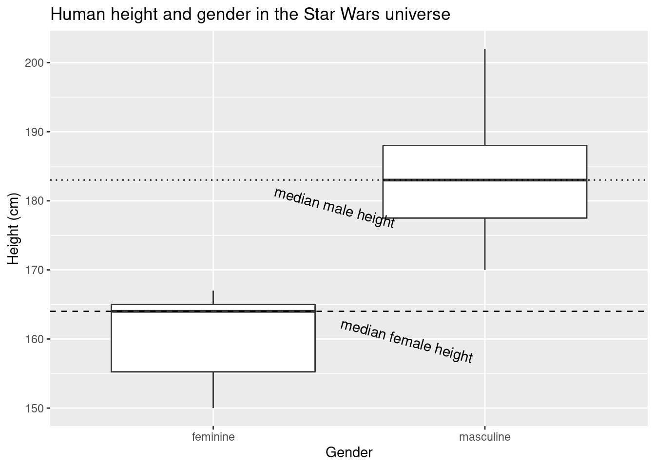
TMI
annotate()
The function annotate allows you to add elements to your plot that may or may not be part of the original data set. This could be text, as in the prior example, or it could be lines (“segment”), rectangles (“rect”), curves (“curve”), etc. This functionality is quite useful if you want to emphasize certain data points or regions of your plot.
yoda_h <- starwars$height[which(starwars$name == "Yoda")]
yoda_m <- starwars$mass[which(starwars$name == "Yoda")]

wookiee <- starwars |> filter(species == "Wookiee") |>
  select(height, mass)

skywalkers <- starwars |> filter(grepl("Skywalker|Leia", name))

ggplot(data = starwars, aes(x = height, y = mass)) +
  geom_point(size = 2) +
  scale_colour_brewer(palette = "RdYlBu") +
  labs(title = "Height and mass in the Star Wars universe", subtitle = "x and y limits changed using coord_cartesian", x = "Height (cm)", y = "Mass (kg)") +
  coord_cartesian(xlim = c(50, 250),
                  ylim = c(0, 200)) +
  annotate("curve",
           x = yoda_h, xend = yoda_h,
           y = yoda_m + 75, yend = yoda_m,
           arrow = arrow(),
           color = 'green')+
  annotate("text", x = yoda_h, y = yoda_m + 80, label = "Yoda")+
  annotate("rect",
           xmin = min(wookiee$height) - 5, xmax = max(wookiee$height)+ 5,
           ymin = min(wookiee$mass) - 5, ymax = max(wookiee$mass) + 5,
           alpha = .5,
           fill = 'darkorange4'
           )+
  annotate("text",
           x = max(wookiee$height), y = max(wookiee$mass)+10,
           label = "Wookiees") +
  annotate("rect",
           xmin = 40, xmax = 80,
           ymin = 190, ymax = 210,
           color = 'black', fill = 'grey',
           alpha = 0.6) +
  annotate("point", x = skywalkers$height, y = skywalkers$mass,
           size = 4, color = 'blue', alpha = 0.5)+
  annotate("text", x = 50, y = 200, label = "Skywalkers", hjust = 0)+
  annotate("point", x = 45, y = 200, size = 2, color = 'black')+
  annotate("point", x = 45, y = 200, size = 4, color = 'blue', alpha = 0.5) +
  theme_classic() # using pre-defined themes is a quick and simple way to improve the look of your plots
## Warning: Removed 28 rows containing missing values (geom_point).## Warning: Removed 1 rows containing missing values (geom_point).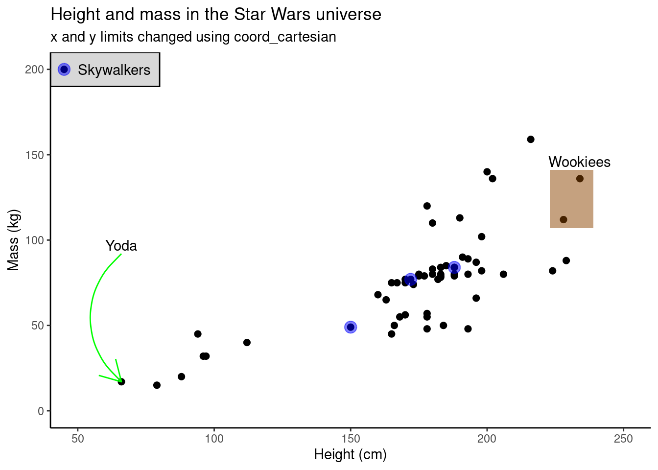
ggplot(data = sw_human_data, aes(x = gender, y = height)) +
  geom_boxplot() +
  labs(title = "Human height and gender in the Star Wars universe", subtitle = "x and y limits changed",
       x = "Gender", y = "Height (cm)") +
  geom_hline(yintercept = median_human_height_gender['feminine'],
             linetype = 2)+
  geom_hline(yintercept = median_human_height_gender['masculine'],
             linetype = 3)+
  annotate("text", x = 2, y = median_human_height_gender['feminine'],
           label = "median female height",
           angle = 345, hjust = 1, vjust = 5)+
  annotate("text", x = 1, y = median_human_height_gender['masculine'],
           label = "median male height", angle = 345, hjust = -0.5, vjust = 0)+
  ylim(c(150, 190))
## Warning: Removed 8 rows containing non-finite values (stat_boxplot).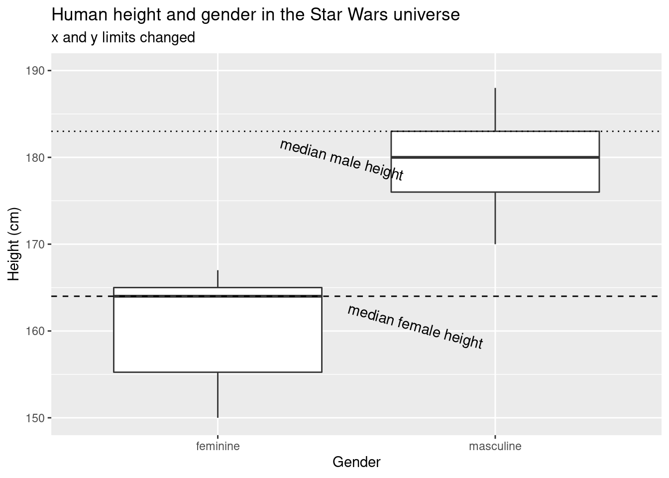
ggplot(data = sw_human_data, aes(x = gender, y = height)) +
  geom_boxplot() +
  labs(title = "Human height and gender in the Star Wars universe", subtitle = "x and y limits changed using coord_cartesian", x = "Gender", y = "Height (cm)")  +
  geom_hline(yintercept = median_human_height_gender['feminine'],
             linetype = 2)+
  geom_hline(yintercept = median_human_height_gender['masculine'],
             linetype = 3) +
  annotate("text", x = 2, y = median_human_height_gender['feminine'],
           label = "median female height", angle = 345, hjust = 1, vjust = 5)+
  annotate("text", x = 1, y = median_human_height_gender['masculine'],
           label = "median male height", angle = 345, hjust = -0.5, vjust = 0)+
  coord_cartesian(ylim = c(150, 190))
## Warning: Removed 4 rows containing non-finite values (stat_boxplot).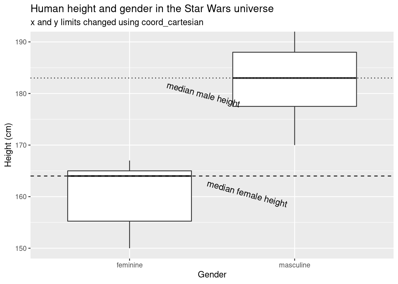
When we manually set the y axis limits without using
coord_cartesian, the median height of masculine characters
differs by about 3 cm.
Box plots and violin plots
ggplot(data = sw_human_data, aes(x = gender, y = height)) +
  geom_boxplot() +
  labs(title = "Human height by gender in the Star Wars universe",x = "Gender", y = "Height (cm)")
## Warning: Removed 4 rows containing non-finite values (stat_boxplot).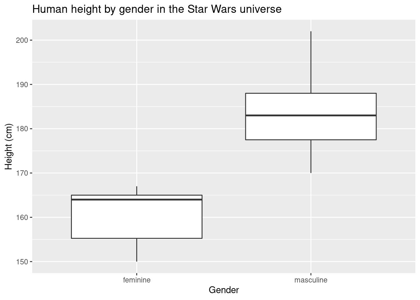
One of the benefits of ggplot2 is that you can easily (once you get used to the ggplot2 syntax) combine different types of visualizations. You can overlay a violin plot with box plots while plotting the individual data points all in one plot
ggplot(data = sw_human_data, aes(x = gender, y = height)) +
  geom_violin() +
  geom_boxplot(width = 0.25) +
  geom_jitter(size = 3, width = 0.25) + # geom_jitter in geom_point() but with the points "jittered"
  labs(title = "Human height by gender in the Star Wars universe",x = "Gender", y = "Height (cm)")
## Warning: Removed 4 rows containing non-finite values (stat_ydensity).## Warning: Removed 4 rows containing non-finite values (stat_boxplot).## Warning: Removed 4 rows containing missing values (geom_point).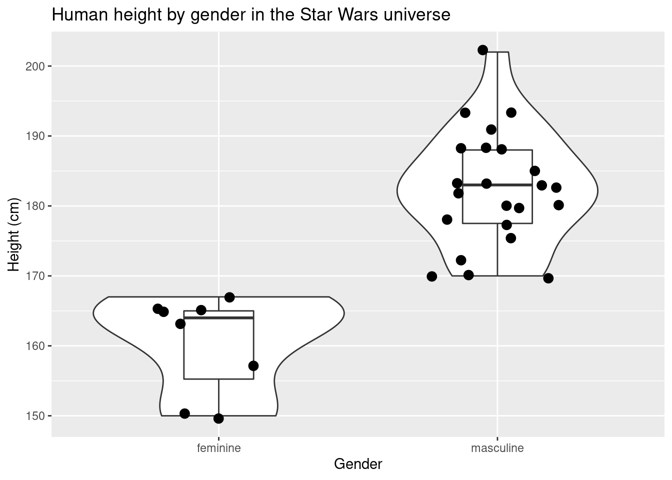
You can continue to add more groups or variables for more complex plots.
ggplot(data = sw_human_data, aes(x = gender, y = height)) +
  geom_violin() +
  geom_boxplot(width = 0.25) +
  geom_jitter(size = 3, width = 0.25, aes(color = homeworld)) + # geom_jitter in geom_point() but with the points "jittered"
  labs(title = "Human height by gender in the Star Wars universe",x = "Gender", y = "Height (cm)")
## Warning: Removed 4 rows containing non-finite values (stat_ydensity).## Warning: Removed 4 rows containing non-finite values (stat_boxplot).## Warning: Removed 4 rows containing missing values (geom_point).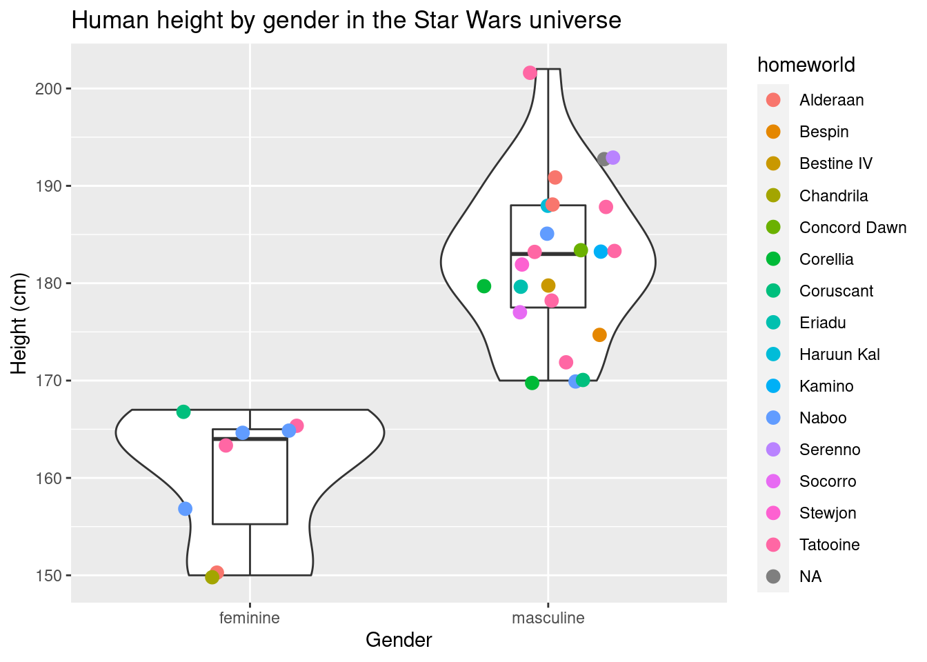
ggplot(data = sw_human_data, aes(x = gender, y = height)) +
  geom_violin() +
  geom_boxplot(width = 0.25) +
  geom_jitter(size = 3, width = 0.25, aes(color = mass)) + # geom_jitter in geom_point() but with the points "jittered"
  labs(title = "Human height by gender in the Star Wars universe",x = "Gender", y = "Height (cm)")
## Warning: Removed 4 rows containing non-finite values (stat_ydensity).## Warning: Removed 4 rows containing non-finite values (stat_boxplot).## Warning: Removed 4 rows containing missing values (geom_point).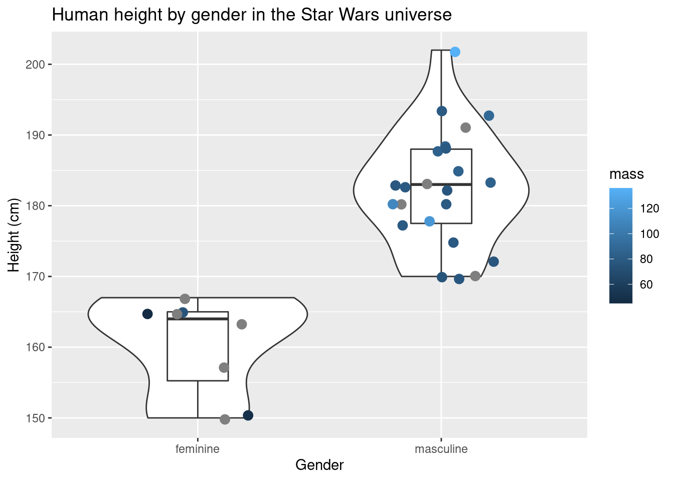
Histograms
ggplot(data = sw_human_data, aes(x = height)) +
  geom_histogram(binwidth = 10) +
  labs(title = "Human height histogram in the Star Wars universe",x =  "Height (cm)")
## Warning: Removed 4 rows containing non-finite values (stat_bin).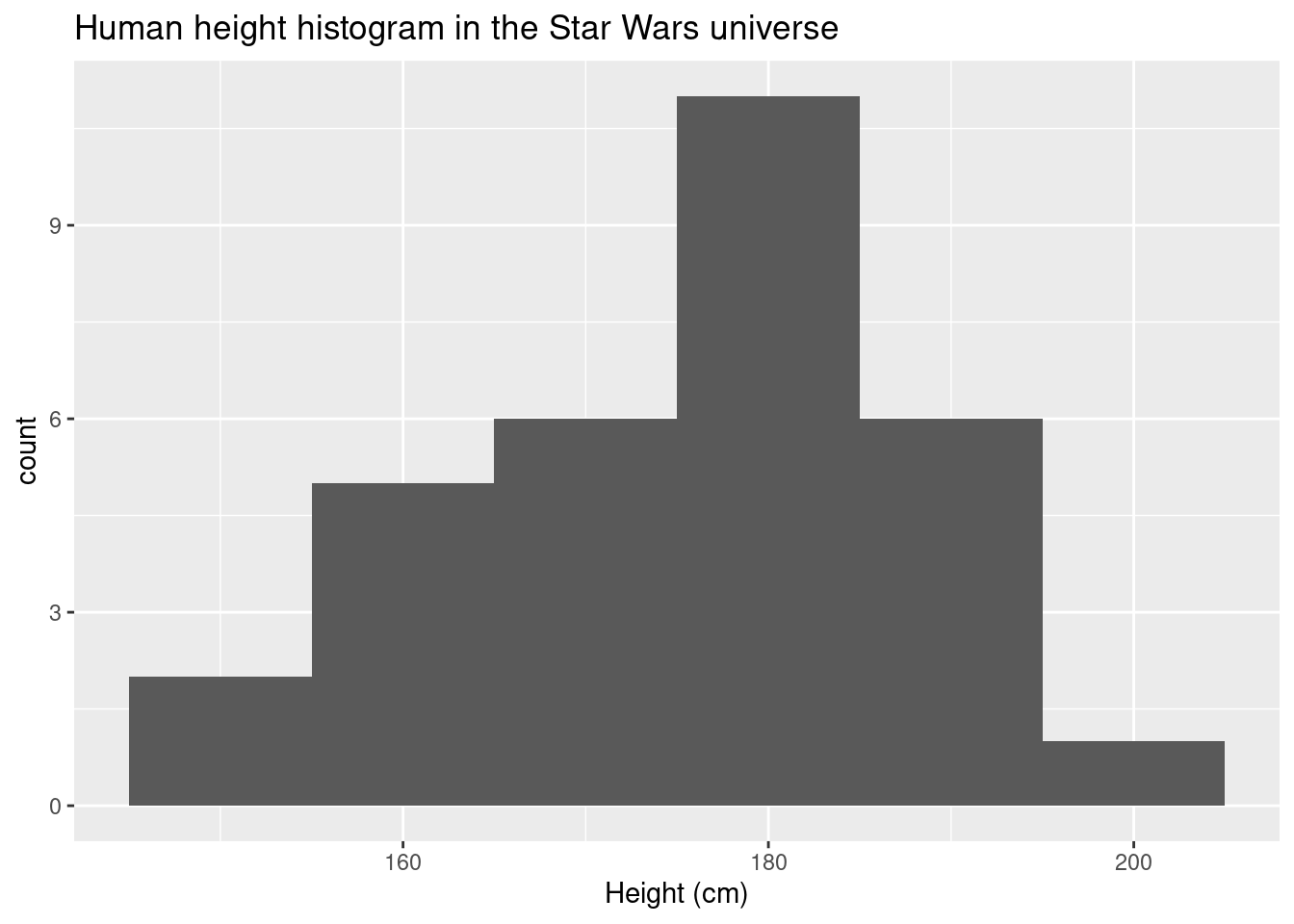
Different binwidths have an effect on the shape of the histogram.
ggplot(data = sw_human_data, aes(x = height)) +
  geom_histogram(binwidth = 10) +
  geom_histogram(binwidth = 3, fill = "red") +
  labs(title = "Human height histogram in the Star Wars universe",x =  "Height (cm)")
## Warning: Removed 4 rows containing non-finite values (stat_bin).
## Removed 4 rows containing non-finite values (stat_bin).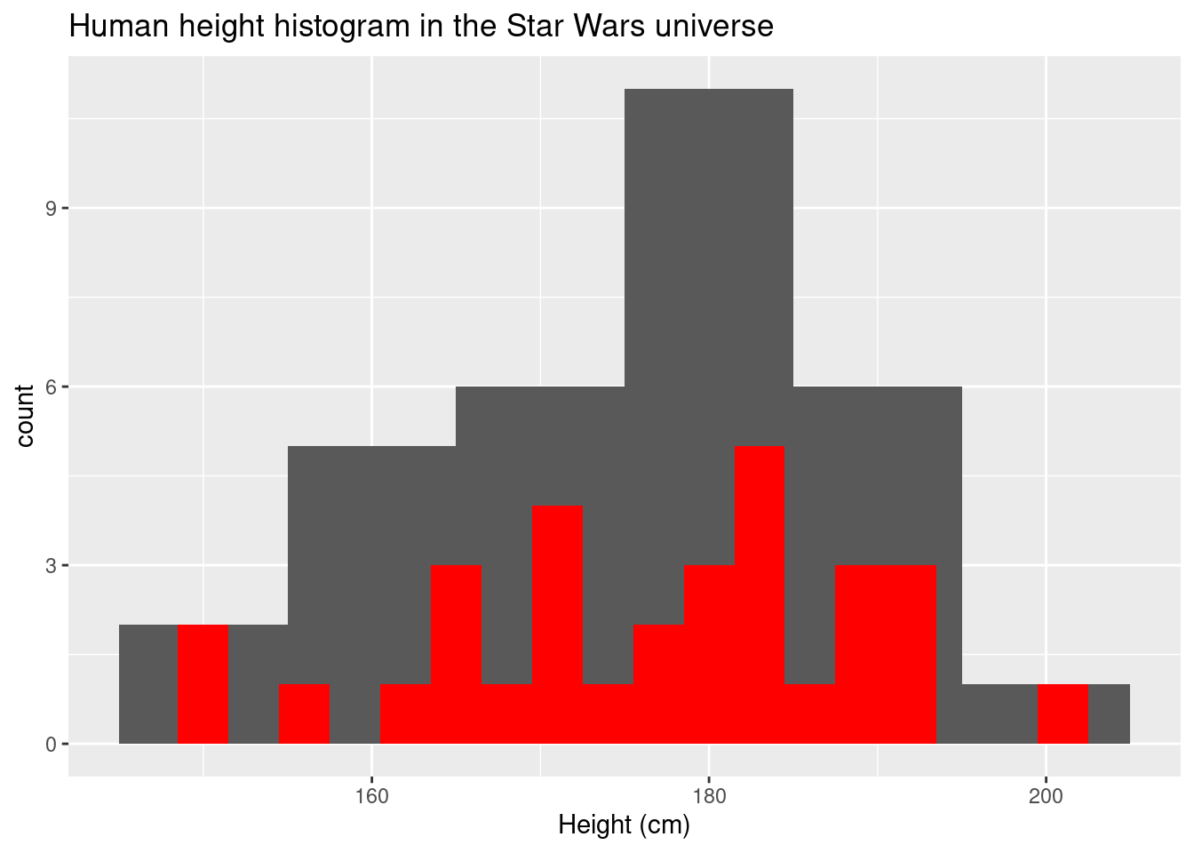
sw_nonhuman_data <-
starwars %>%
  mutate(human = ifelse(species == "Human", "Human", "Non-Human"))


ggplot(data = sw_nonhuman_data, aes(x = height, fill = human)) +
  geom_histogram(binwidth = 10) +
  labs(title = "Height histogram in the Star Wars universe", subtitle = "Human vs Non-Human", x =  "Height (cm)")
## Warning: Removed 6 rows containing non-finite values (stat_bin).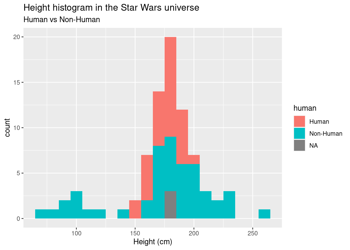
In this final plot we’ll connect points and we’ll deal with object type problems.
We’ll simulate data so that we have multiple measurements for an individual.
data <-
data.frame(ID = rep(c("a", "b", "c", "d"), times = 2),
           week = rep(c(1, 2), each = 4),
           measure = c(rnorm(4, 5, 2),
                       rnorm(4, 10, 2)))
glimpse(data)
## Rows: 8
## Columns: 3
## $ ID <chr> "a", "b", "c", "d", "a", "b", "c", "d"
## $ week <dbl> 1, 1, 1, 1, 2, 2, 2, 2
## $ measure <dbl> 5.151549, 2.834430, 4.809382, 5.461834, 7.981721, 10.447433, 1…First, let’s plot the data to see if there is a difference between weeks.
ggplot(data = data, aes(x = week, y = measure)) +
  geom_boxplot() +
  geom_point()
## Warning: Continuous x aesthetic -- did you forget aes(group=...)?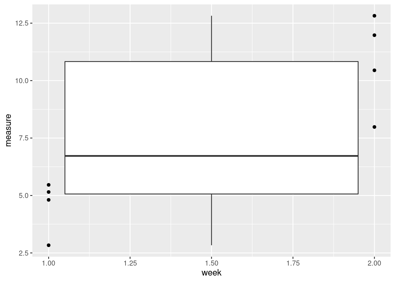
That seems wrong. What happened?
R interprets “week” as a continuous variable. We want to treat it as a factor.
ggplot(data = data, aes(x = as.factor(week), y = measure)) +
  geom_boxplot() +
  geom_point()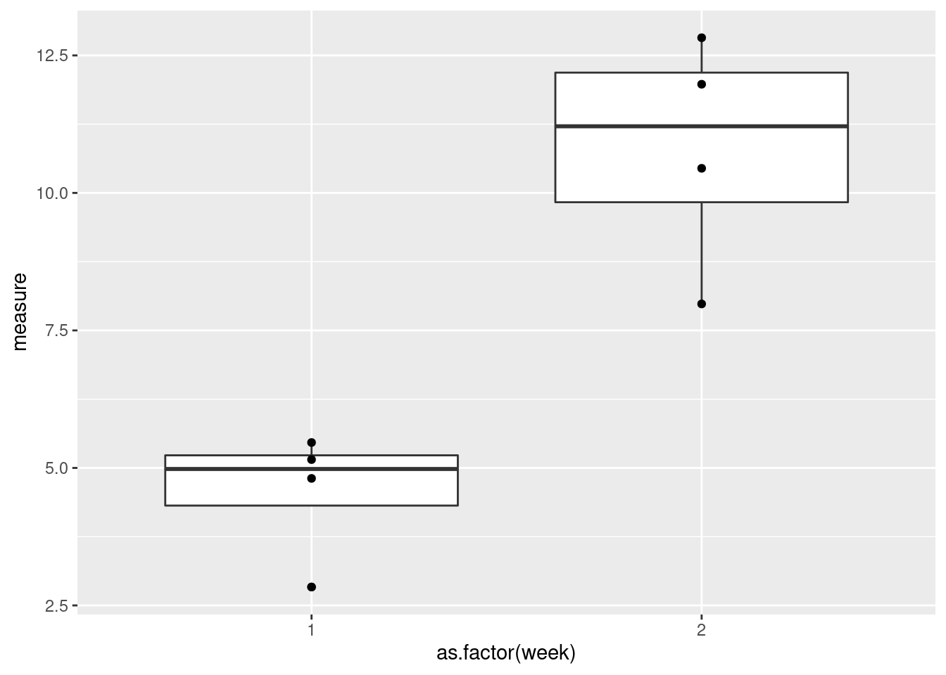
That’s better!
Now, let’s connect the points by subject ID.
ggplot(data = data, aes(x = as.factor(week), y = measure)) +
  geom_boxplot() +
  geom_point() +
  geom_path(aes(group = ID))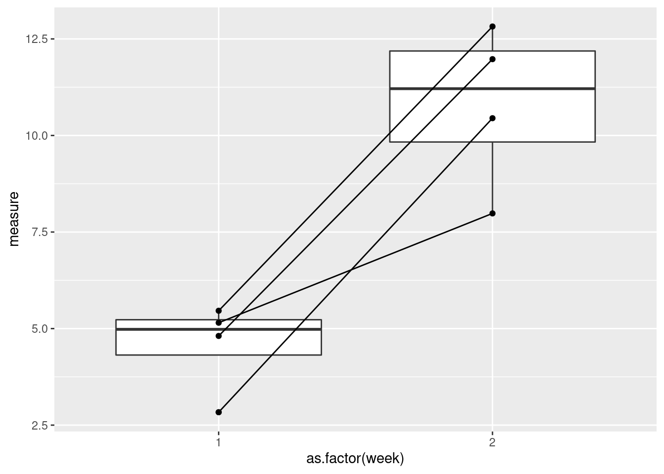
Check your understanding
Check your understanding
Check 4
I have replicated an infamous plot published in a Business Insider article using data from the Florida Department of Law Enforcement. The article discusses a law passed in Florida that relates to the use of deadly force in self-defense situations. “Stand-your-ground” laws are somewhat controversial so if you’re interested in the topic, there’s a lot out there. For this lesson, however, we’re really only interested in the details of how the data is visualized.
dat <- read.csv("../data/FL_Murder_by_Weapon_1995-2020.csv")
head(dat)
## Year Total.Offenses Firearm Knife..Cutting.Instrument Hands..Fist..Feet Other
## 1 1995 1030 687 135 50 158
## 2 1996 1077 668 146 85 178
## 3 1997 1014 634 129 87 164
## 4 1998 966 589 115 86 176
## 5 1999 856 460 132 98 166
## 6 2000 890 499 131 83 177glimpse(dat)## Rows: 26
## Columns: 6
## $ Year <int> 1995, 1996, 1997, 1998, 1999, 2000, 2001, 20…
## $ Total.Offenses <int> 1030, 1077, 1014, 966, 856, 890, 867, 906, 9…
## $ Firearm <int> 687, 668, 634, 589, 460, 499, 502, 552, 586,…
## $ Knife..Cutting.Instrument <int> 135, 146, 129, 115, 132, 131, 108, 114, 121,…
## $ Hands..Fist..Feet <int> 50, 85, 87, 86, 98, 83, 91, 82, 77, 94, 75, …
## $ Other <int> 158, 178, 164, 176, 166, 177, 166, 158, 140,…ggplot(data = dat, aes(x = Year, y = Firearm))+
geom_area(fill = 'darkred', alpha = 0.8)+
geom_line() +
scale_y_reverse(limits = c(1200, 0),
breaks = seq(1200, 0, -200),
labels = seq(1200, 0, -200))+
scale_x_continuous(breaks = c(2000, 2010, 2020), labels = c("1990s", "2000s", "2010s"))+
ylab(label = element_blank())+
xlab(label = element_blank())+
labs(caption = "Recreation of a plot published in a Business Insider article from FEB 18, 2014.\nData is from Florida Department of Law Enforcement.\nOriginal plot showed data from 1990-2012, current plot shows data from 1995-2020.")+
ggtitle("Gun deaths in Florida",
subtitle = "Number of murders committed using firearms")+
annotate(geom = "text",
x = dat$Year[1], y = dat$Firearm[1],
vjust = 2,
label = as.character(dat$Firearm[1]))+
annotate(geom = "text",
x = tail(dat$Year, n = 1), y = tail(dat$Firearm, n = 1),
vjust = 2,
label = as.character(tail(dat$Firearm, n = 1)))+
annotate(geom = "segment",
x = 2005, xend = 2005,
y = dat$Firearm[which(dat$Year == 2005)],
yend = dat$Firearm[which(dat$Year == 2005)] - 100,
color = 'white'
)+
annotate(geom = "text",
x = 2005,
y = dat$Firearm[which(dat$Year == 2005)] - 250,
label = "2005\nFlorida enacted \nits 'Stand Your \nGround' law",
color = 'white',
hjust = 0,
)+
geom_point(size = 4, color = 'white', fill = 'black', shape = 21)+
theme(
panel.background = element_rect(fill = "white", color = "white"),
plot.title = element_text(size = 24, face = "bold"),
axis.text.x = element_text(hjust = 3, vjust = 5),
axis.ticks.length.x = unit(-0.4, "cm"),
panel.grid.major.y = element_line(color = "grey"),
panel.grid.major.x = element_blank(),
plot.caption = element_text(hjust = 0)
)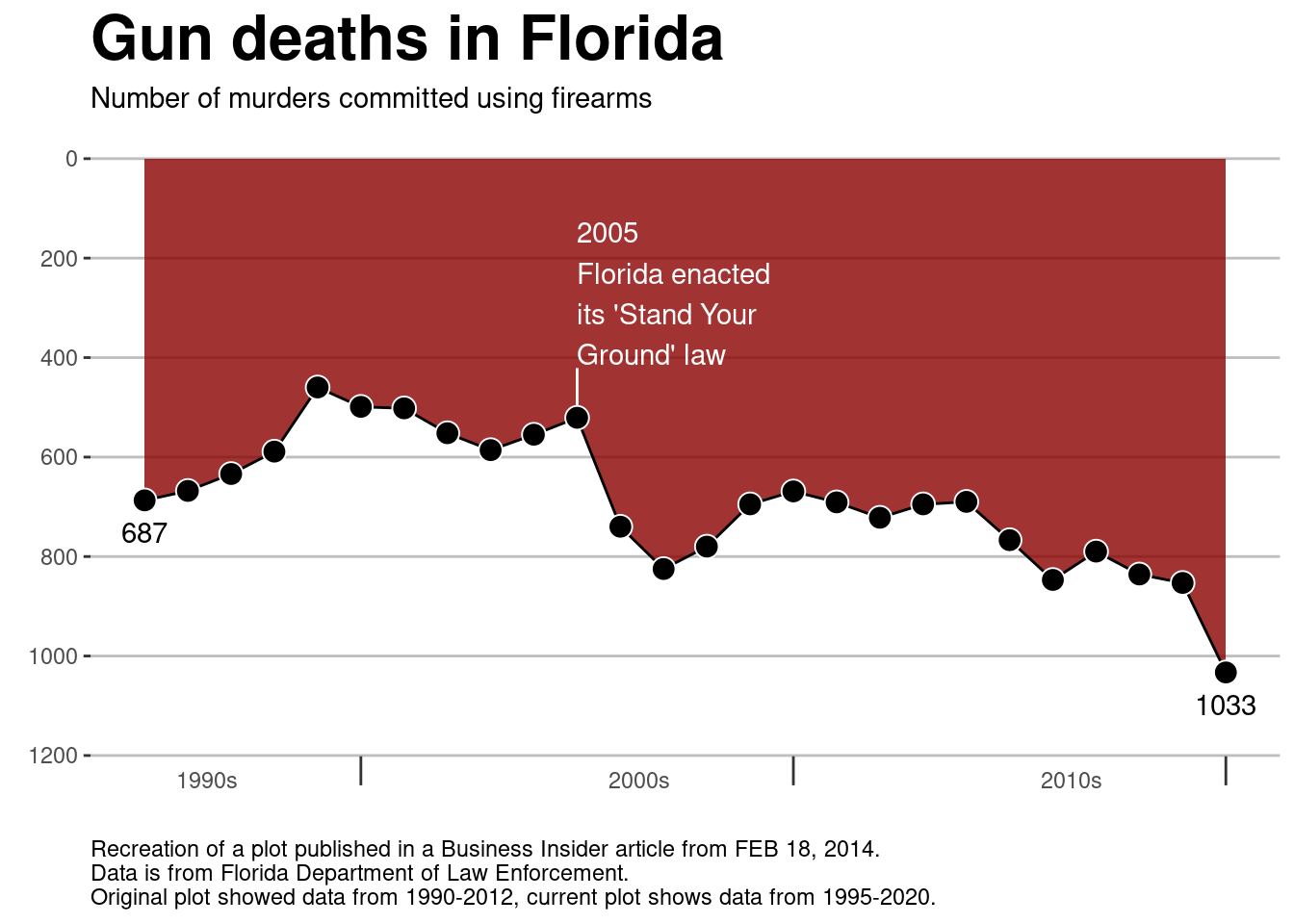
Before looking in detail at the code or the plot, what are your initial impressions of the plot? What does it do well? What could be done better? What does the plot tell you?
This plot makes (at least) one pretty big mistake. What is it? Why is it a mistake?
An important step in writing code is learning to read code. Take a look at the code above. While it may be quite daunting, you don’t need to understand everything to be able to gain crucial information from the code. What does the line
geom_line()do? Remember that you can check the documentation of a function by using?before the function name. (Google is also your friend in this case as there are tons of tutorials, cheat sheets, and vignettes that can explain things in more detail.)You should always read the documentation, but not all documentation is created equal. Writing documentation is not easy and many programmers often treat it as an afterthought. But, you can approach coding like a scientist!
Form a hypothesis: What do you think the function does?
Design an experiment: How can you change the code to see if the function acts the way you think it does?
Run an experiment: Run the code/program
Analyze the results: Is the output what you expected? If not…
Update your hypothesis and/or experimental design and try again!
What does the function
scale_x_continuousdo, specifically, what does it do in this plot? What about the parametersbreaksandlabels? Formulate a “hypothesis” and design an “experiment” to test the functionscale_x_continuous.
- Which layer/function should you remove/change to make the plot less misleading?
Check 5
We’re going to go back to the starwars data set. We’re
going to look at heights again; this time we’re going to compare heights
across the different home worlds in the star wars universe.
Unfortunately, a lot of the home worlds in the data set only have one or two characters. We’ll first filter the data so that we drop all of the home worlds that have two or fewer characters.
worlds <- starwars |>
  group_by(homeworld) |>
  filter(n() >= 3) |>
  drop_na(homeworld) # drops the observations where the home world is NA
head(worlds)
## # A tibble: 6 × 11
## # Groups: homeworld [3]
## name height mass hair_…¹ skin_…² eye_c…³ birth…⁴ sex gender homew…⁵
## <chr> <int> <dbl> <chr> <chr> <chr> <dbl> <chr> <chr> <chr>
## 1 Luke Skywal… 172 77 blond fair blue 19 male mascu… Tatooi…
## 2 C-3PO 167 75 <NA> gold yellow 112 none mascu… Tatooi…
## 3 R2-D2 96 32 <NA> white,… red 33 none mascu… Naboo
## 4 Darth Vader 202 136 none white yellow 41.9 male mascu… Tatooi…
## 5 Leia Organa 150 49 brown light brown 19 fema… femin… Aldera…
## 6 Owen Lars 178 120 brown,… light blue 52 male mascu… Tatooi…
## # … with 1 more variable: species <chr>, and abbreviated variable names
## # ¹hair_color, ²skin_color, ³eye_color, ⁴birth_year, ⁵homeworldggplot(data = worlds, aes(x = homeworld, height))+
geom_boxplot() +
labs(title = "Height by home world in the Star Wars universe",
y = "Height (cm)",
x = "Home world")+
theme_bw() 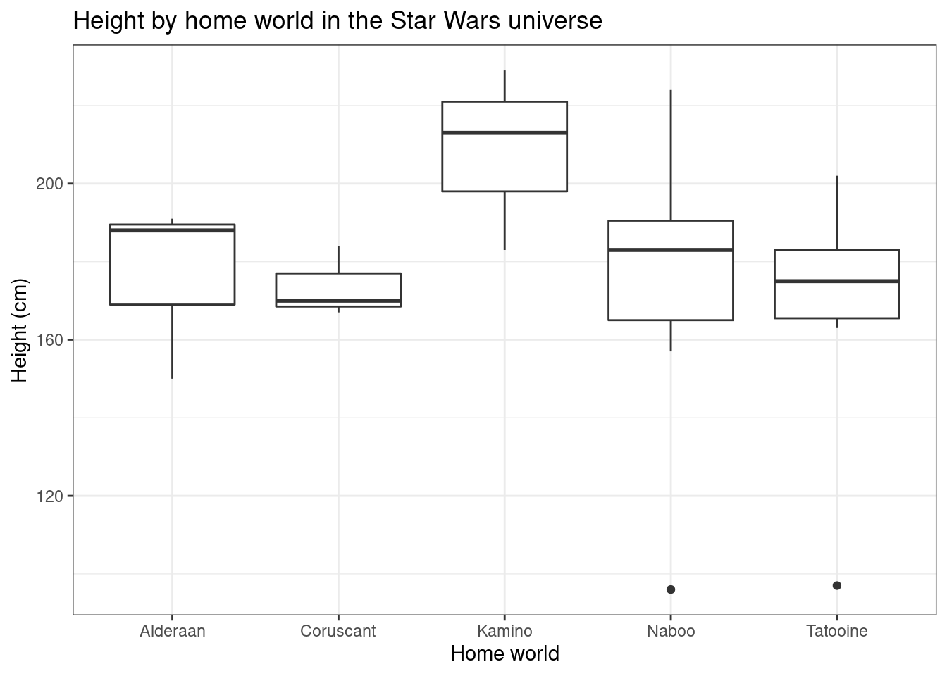
- What information do box plots represent?
- The heavy line in the center of the box?
- the box ends?
- the vertical lines?
- the dots? (see Naboo and Tatooine)
Do you feel like box plots are a good representation of these data? Why or why not?
There is at least one aspect of the data that this plot does not represent well. Add one or more layers to the plot to make the visualization less misleading. (You can directly copy the code from above. You can remove layers if you want, but you don’t have to.)
### YOUR CODE HERE
#
#
#
#
#
Check 6
For this example, we’re going to look at penguin data. These data can
be found in the R package palmerpenguin.
data("penguins")
head(penguins)
## # A tibble: 6 × 8
## species island bill_length_mm bill_depth_mm flipper_l…¹ body_…² sex year
## <fct> <fct> <dbl> <dbl> <int> <int> <fct> <int>
## 1 Adelie Torgersen 39.1 18.7 181 3750 male 2007
## 2 Adelie Torgersen 39.5 17.4 186 3800 fema… 2007
## 3 Adelie Torgersen 40.3 18 195 3250 fema… 2007
## 4 Adelie Torgersen NA NA NA NA <NA> 2007
## 5 Adelie Torgersen 36.7 19.3 193 3450 fema… 2007
## 6 Adelie Torgersen 39.3 20.6 190 3650 male 2007
## # … with abbreviated variable names ¹flipper_length_mm, ²body_mass_gglimpse(penguins)## Rows: 344
## Columns: 8
## $ species <fct> Adelie, Adelie, Adelie, Adelie, Adelie, Adelie, Adel…
## $ island <fct> Torgersen, Torgersen, Torgersen, Torgersen, Torgerse…
## $ bill_length_mm <dbl> 39.1, 39.5, 40.3, NA, 36.7, 39.3, 38.9, 39.2, 34.1, …
## $ bill_depth_mm <dbl> 18.7, 17.4, 18.0, NA, 19.3, 20.6, 17.8, 19.6, 18.1, …
## $ flipper_length_mm <int> 181, 186, 195, NA, 193, 190, 181, 195, 193, 190, 186…
## $ body_mass_g <int> 3750, 3800, 3250, NA, 3450, 3650, 3625, 4675, 3475, …
## $ sex <fct> male, female, female, NA, female, male, female, male…
## $ year <int> 2007, 2007, 2007, 2007, 2007, 2007, 2007, 2007, 2007…penguins <- penguins |> na.omit()
glimpse(penguins)## Rows: 333
## Columns: 8
## $ species <fct> Adelie, Adelie, Adelie, Adelie, Adelie, Adelie, Adel…
## $ island <fct> Torgersen, Torgersen, Torgersen, Torgersen, Torgerse…
## $ bill_length_mm <dbl> 39.1, 39.5, 40.3, 36.7, 39.3, 38.9, 39.2, 41.1, 38.6…
## $ bill_depth_mm <dbl> 18.7, 17.4, 18.0, 19.3, 20.6, 17.8, 19.6, 17.6, 21.2…
## $ flipper_length_mm <int> 181, 186, 195, 193, 190, 181, 195, 182, 191, 198, 18…
## $ body_mass_g <int> 3750, 3800, 3250, 3450, 3650, 3625, 4675, 3200, 3800…
## $ sex <fct> male, female, female, female, male, female, male, fe…
## $ year <int> 2007, 2007, 2007, 2007, 2007, 2007, 2007, 2007, 2007…ggplot(data = penguins, aes(x = bill_length_mm, y = bill_depth_mm))+
geom_point() +
labs(x="Length (mm)", y="Depth (mm)", title="Penguin Bill Depth by Bill Length")+
theme_bw()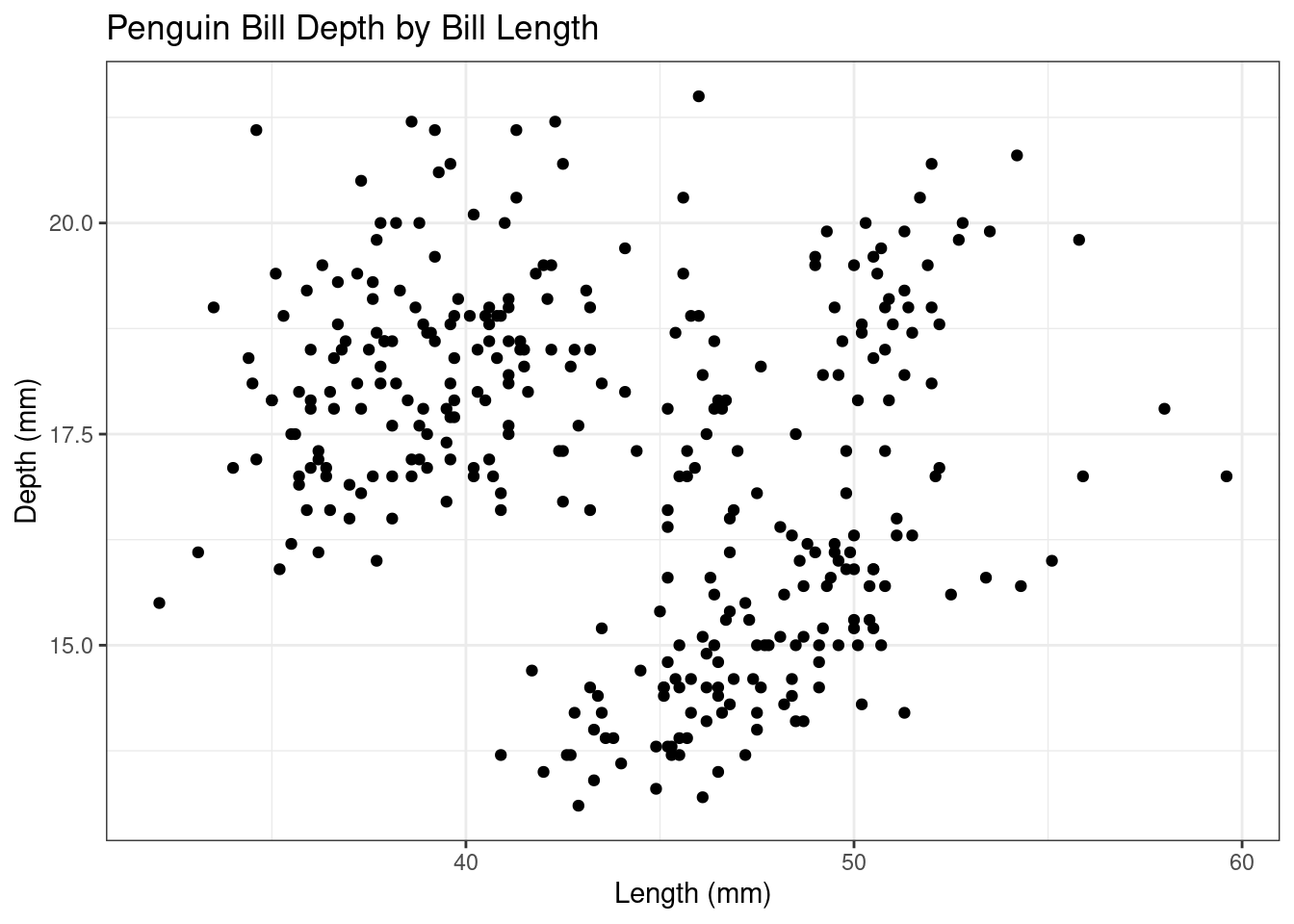
Do you think there is a relationship between Penguin bill length and bill depth? If so, do you think it’s a positive or negative relationship based on the plot?
Take a look at the rest of the columns in the data set.
colnames(penguins)## [1] "species" "island" "bill_length_mm"
## [4] "bill_depth_mm" "flipper_length_mm" "body_mass_g"
## [7] "sex" "year"Do you think there are any other variables that might help you better understand the relationship between bill length and bill depth?
- How would you add the variable(s) to the plot to help illustrate that relationship?
### YOUR CODE HERE
#
#
#
#
#
Summary
ggplot2 gives you a lot of power and flexibility to make
really nice visualizations. It can’t do everything though. There are
packages, however, that build on ggplot2. You can even
create interactive 3D plots and animations. It does take a bit of time
to get used to the syntax and you will spend a lot of time on Google
(even for things you’ve done multiple times). But once you get familiar
with it, you’ll have a lot of fun creating beautiful plots!
================================================================================
Session information:
Last update on 2022-01-03
sessionInfo()## R version 4.2.2 Patched (2022-11-10 r83330)
## Platform: x86_64-pc-linux-gnu (64-bit)
## Running under: Ubuntu 20.04.5 LTS
##
## Matrix products: default
## BLAS: /usr/lib/x86_64-linux-gnu/blas/libblas.so.3.9.0
## LAPACK: /usr/lib/x86_64-linux-gnu/lapack/liblapack.so.3.9.0
##
## locale:
## [1] LC_CTYPE=en_US.UTF-8 LC_NUMERIC=C
## [3] LC_TIME=de_AT.UTF-8 LC_COLLATE=en_US.UTF-8
## [5] LC_MONETARY=de_AT.UTF-8 LC_MESSAGES=en_US.UTF-8
## [7] LC_PAPER=de_AT.UTF-8 LC_NAME=C
## [9] LC_ADDRESS=C LC_TELEPHONE=C
## [11] LC_MEASUREMENT=de_AT.UTF-8 LC_IDENTIFICATION=C
##
## attached base packages:
## [1] stats graphics grDevices utils datasets methods base
##
## other attached packages:
## [1] palmerpenguins_0.1.1 RColorBrewer_1.1-3 tidyr_1.2.0
## [4] dplyr_1.0.10 ggplot2_3.3.6
##
## loaded via a namespace (and not attached):
## [1] tidyselect_1.1.2 xfun_0.32 bslib_0.4.0 purrr_0.3.4
## [5] splines_4.2.2 lattice_0.20-45 colorspace_2.0-3 vctrs_0.4.1
## [9] generics_0.1.3 htmltools_0.5.3 yaml_2.3.5 mgcv_1.8-41
## [13] utf8_1.2.2 rlang_1.0.5 jquerylib_0.1.4 pillar_1.8.1
## [17] glue_1.6.2 withr_2.5.0 DBI_1.1.2 lifecycle_1.0.1
## [21] stringr_1.4.1 munsell_0.5.0 gtable_0.3.0 fontawesome_0.4.0
## [25] evaluate_0.16 labeling_0.4.2 knitr_1.40 fastmap_1.1.0
## [29] fansi_1.0.3 highr_0.9 scales_1.2.0 cachem_1.0.6
## [33] jsonlite_1.8.0 farver_2.1.0 digest_0.6.29 stringi_1.7.8
## [37] grid_4.2.2 cli_3.3.0 tools_4.2.2 magrittr_2.0.3
## [41] sass_0.4.2 tibble_3.1.8 pkgconfig_2.0.3 Matrix_1.4-1
## [45] ellipsis_0.3.2 assertthat_0.2.1 rmarkdown_2.16 rstudioapi_0.14
## [49] R6_2.5.1 nlme_3.1-160 compiler_4.2.2================================================================================
Copyright © 2022 Dan C. Mann. All rights reserved.